Showing posts with label typography. Show all posts

Friday, 10 October 2014

External Box Design

Now that my typography and ornaments are totally completed I can concentrate on putting them together and creating a solid 'brand' for the brief. Below are the final designs for the external box (not to scale), featuring both the typography, the borders and everything else I've made so far.


Final Border Design (digitalised)


These are the finalised borders, text ornaments and small details of the external box. From being hand rendered in my sketchbook I then used the Marquee tool, the Polygonal Lasso tool and the Fill tool in Photoshop to finish them off properly and to the high standard I wanted. An advantage of having the big files digitally also means I can edit them when and how I please and if I want I can play with colour really easily.

Border Final Design (sketchbook)


Again drawing influence from the extensive research I've undertaken I was able to again draw my own Art Deco border. Some other influences include the Great Gatsby film, and the associated design and branding with that.


What inspired me most from these designs were definitely from the sharp, angular lines shooting across the canvas from all directions. However, the geometry is still very precise and disciplined and it can be seen how delicately the features were placed. The custom text is the main focal point of the image and stands out because of its rounded edges and silver texture, distinguishing it from the bronze-gold present in the rest of the work. The diagonal lines down from the logo help draw the eye down to the release date text and are an example of how good graphic design can control a viewers appreciation of the image.


The same style of intricate design is present in this poster too, although in a slightly muted way. The borders frame the characters beautifully and although in their own right they hold a place in the stars they don't steal any thunder from the cast. Again it can be seen that the diagonal lines present to draw the eye in certain places are there, this time directing you to the title of the film and the young woman resting on the credits.


(images credit to https://www.behance.net/Likeminded and all belong to their respective designers.)

Digitalised Typography


This is the result of editing the text digitally. As you can see when compared with the hand rendered copy, there are some small changes made to the type to make sure it all looks uniform and part of a 'set'. This kind of unique type will help push the independent brand of 'Iggy Azalea' and because it's so unique it should be recognisable anywhere, on posters, adverts and of course on the album itself. 

I had a lot of fun creating the text and going in a more graphic design orientated direction, as opposed to just finding some type I liked on a website and whacking it on the finished product like some illustrators might. Therefore I have the same reasoning behind drawing and digitally rendering my own Deco style border, thus adding another unique element to the album and really making it worthy of being a special edition. 

Specific Type Research

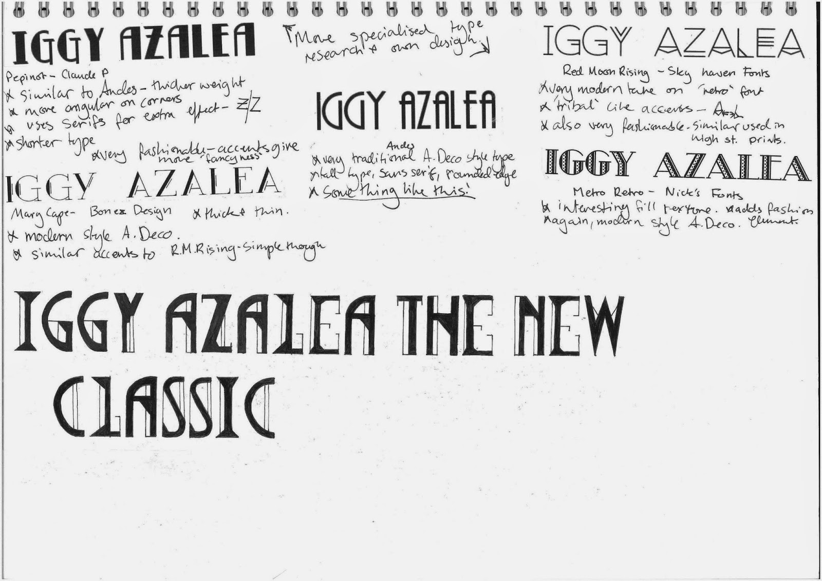
Sketchbook based research focusing specifically on Art Deco style typefaces. 


After researching enough typography I was able to create my own type specifically for this project. Drawing influences from both modern and authentic style Art Deco types is how I was able to make it using typographical guidelines using rulers and measurements. To professionalise the type I will be rendering it digitally to give it a smooth, polished look, and this will also enable me to easily edit it and play around with compositions and layouts.

Stylised Art Deco Style Type Research

Sketchbook based typography research in the Art Deco and Art Nouveau styles. 


General Typography Research

Sketchbook based generalised typography research.