Showing posts with label analysis. Show all posts

Saturday, 27 September 2014

Vinyl Cover Research (3)

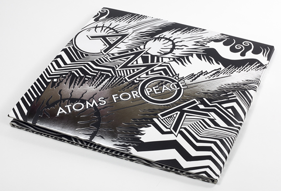
When browsing through www.creativereview.co.uk  I found another album design which really did catch my eye. Designed and illustrated by Stanley Donwood, it of course features the iconic style he is renowned for, and features silver metallic flashes to emphasise the title typography.


Now, this type of illustration isn't my style, but I can appreciate the technical ability that comes into this. I can also appreciate the spectacular Limited Editions of this album (in both CD and vinyl), with its (again) concertina folds showcasing a full spread of Donwood's intricate work.


The illustrated spread shows a post-apocalyptic scene of the Hollywood hills. Quite fitting then, for an album named 'Amok' by a band called 'Atoms for Peace'. This shows that a certain synergy between album and artwork is needed to draw the audience in, especially those that would be interested in purchasing a collectors item such as this. 

Although my album packaging probably won't span the same length as this I think I definitely want it to have a decent amount of image space. In this design the title text is merged with the illustrations but this isn't really my style of doing things and so I would need either a clear space or a separate canvas entirely to house the text. 

(all images credit www.creativereview.co.uk )

Vinyl Cover Research (2)

Another vinyl cover I found really intruiging is this one from band 'Cave Painting'. The album was "inspired by Japanese paper engineering and binding techniques"[1]. 


 At first glance the album does look stylish, with the white background contrasting sharply with the diamond in the center. Opening it up, however, shows a fantastic concertina fold with each page colourfully gradiated and a different cut made in each layer to put together the diamond you see on the outside.


 The vinyl cover differs from the CD cover, but not by much. The thoughful design is still present just manifesting in a different way- a pattern of die cut shapes show the inner sleeve underneath, giving an animated effect when removed. 


Again, although this is something I find creatively inspiring I'm finding it hard to figure out a way to connect it with the album I'm doing now. Somehow I need to make my own visually engaging packaging, combining all the aspects of the concept I have and of the illustrations I create for it. 


 (Images from www.creativereview.co.uk  )
[1] Gavin Lucas, www.creativereview.co.uk, visited 27/09/2014

Vinyl Cover Research (1)

So after some initial research into the depths of the internet, I found some exotic examples of creative vinyl packaging. This design was the first that caught my eye because of the impressive origami- yes, this 'sleeve' is composed of screen printed, origami folded paper.


At first glance it may not even seem like a vinyl cover. The paper is folded in a way representative of a birthing flower and reportedly was supposed to portray the feel and atmosphere of the music inside.


The paper cover gives a hand crafted feel, with attention to detail all over the octagonal origami. 
I like it because it's so different- how many mainstream artists go the extra mile to ensure their work is so totally different from anything else? I don't know but what I do know now is that it's entirely possible to make a feasible design from the simplest of materials. 

At this moment I'm unsure as to how this inspiration could come across in my work, but I'm toying with the idea of possibly using some type of printing in the packaging. Possibly it will only be for the title or some effects but who knows yet. 


Thursday, 25 September 2014

The Concept

The concept behind my work for this album is the ideal of the 'American Dream', focusing on the high-class and very fashionable era of the 1920s- 30s (think 'the Great Gatsby' with a more modern perspective).

The Great Gatsby, F. Scott Fitzgerald, Vintage Classics cover 2013 [1]

My reasoning behind this is that this era was very much focused on wealth and the things that often go with it, i.e. fast cars, fashionable clothes and well-furnished homes. The general ethos in that time was that with enough work, even more determination and just a pinch of luck was that you could achieve the unachievable; incredible success for you and your family in 'The Land of Dreams'.
Iggy herself journeyed to America in pursuit of her own aspirations, and the story of this is well interwined in the lyrics, going hand in hand with her tales of new found fame, money and access to the world of fasion and luxury.

Another constant allegory within her songwriting is the determination to have a booming career. Running along the same lines as that is that she possesses some lone wolf qualities enabling her to work without distractions and hindrances. This is something I'll definitely try to convey in what I create although exactly how I'm not sure yet. This is where research comes into play as now I need to research typical items associated with all of these themes. By using research I can really dig deep into my concept and get the work spot on.

Wednesday, 24 September 2014

Song Analysis- 'Fuck Love'


Song Analysis- 'Lady Patra'


Song Analysis- 'Goddess'


Song Analysis- 'Impossible Is Nothing'


Song Analysis- 'Work'


Song Analysis- 'New Bitch'


Song Analysis- 'Fancy'


Song Analysis- 'Change Your Life'


Song Analysis- '100'


Song Analysis- 'Don't Need Y'all'


Song Analysis- 'Walk the Line'