Showing posts with label book research. Show all posts

Saturday, 27 September 2014

Vinyl Cover Research (3)

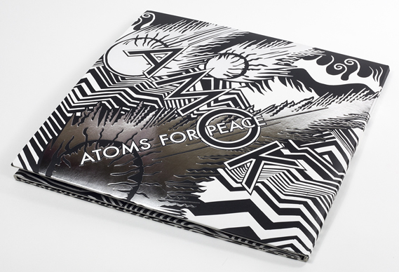
When browsing through www.creativereview.co.uk  I found another album design which really did catch my eye. Designed and illustrated by Stanley Donwood, it of course features the iconic style he is renowned for, and features silver metallic flashes to emphasise the title typography.


Now, this type of illustration isn't my style, but I can appreciate the technical ability that comes into this. I can also appreciate the spectacular Limited Editions of this album (in both CD and vinyl), with its (again) concertina folds showcasing a full spread of Donwood's intricate work.


The illustrated spread shows a post-apocalyptic scene of the Hollywood hills. Quite fitting then, for an album named 'Amok' by a band called 'Atoms for Peace'. This shows that a certain synergy between album and artwork is needed to draw the audience in, especially those that would be interested in purchasing a collectors item such as this. 

Although my album packaging probably won't span the same length as this I think I definitely want it to have a decent amount of image space. In this design the title text is merged with the illustrations but this isn't really my style of doing things and so I would need either a clear space or a separate canvas entirely to house the text. 

(all images credit www.creativereview.co.uk )

Vinyl Cover Research (2)

Another vinyl cover I found really intruiging is this one from band 'Cave Painting'. The album was "inspired by Japanese paper engineering and binding techniques"[1]. 


 At first glance the album does look stylish, with the white background contrasting sharply with the diamond in the center. Opening it up, however, shows a fantastic concertina fold with each page colourfully gradiated and a different cut made in each layer to put together the diamond you see on the outside.


 The vinyl cover differs from the CD cover, but not by much. The thoughful design is still present just manifesting in a different way- a pattern of die cut shapes show the inner sleeve underneath, giving an animated effect when removed. 


Again, although this is something I find creatively inspiring I'm finding it hard to figure out a way to connect it with the album I'm doing now. Somehow I need to make my own visually engaging packaging, combining all the aspects of the concept I have and of the illustrations I create for it. 


 (Images from www.creativereview.co.uk  )
[1] Gavin Lucas, www.creativereview.co.uk, visited 27/09/2014

Wednesday, 14 May 2014

Brainstorming


So because I set a theme I first did a little brainstorming in my sketchbook to help me get some ideas down. I was thinking about things like the setting and the characters, from the clothes to the hair and other fashions. I also thought I could try looking through old family photo albums to see if I could draw any inspiration from those pictures; it would also add a more personal element to my work. 

The setting I thought would be best for this kind of theme was a beachside hotel, with big tall windows and featuring gorgeous Georgian architecture. To gain some inspiration for this, there are some seaside towns near where I live that I could visit and take photographs of and draw the buildings there.


Monday, 24 March 2014

A Series of Unfortunate Events by Lemony Snickett

Another favourite book from my childhood is A Series of Unfortunate Events by Lemony Snickett.
The series is thirteen books long and features lots of illustrations and design within them. Brett Helquist illustrated the books, who I have also researched before for a previous module, however he is a favourite illustrator of mine and has worked in tandem with the author in this case to produce illustrations and vignettes that flow with the text.


Another thing I always admired in the books were the patterned end pages. Not many children's books I had read at that age had had much thought put into the end pages, they are usually just blank. 


Above to the right is an example of the extraordinary ways the illustrations work with the content. The first sentence refers to mirrors and reflections, and the chapter vignette is 'reflected' too. It's a unique little detail which I really love in these books- Brett takes into account the books contents when producing his illustrations and is something I would like to be able to do in future.

The full page illutrations throughout the books are highly detailed also. The illustrations look to be done in pencil, and the coloured ones painted possibly digitally or with ink. Brett also plays around with unusual perspectives and compositions in his work too, as seen in the full page illustration below. 


One of my favourite examples of his work in this book is in the reflection of the above pages. The fact that he has utilized the space of the double pages to produce an effective illustration like this is impressive without looking too loud or distracting to the reader.

Again I'm noticing patterns in the illustrated books I like- lots of vignettes, little quirky details and interesting compositions. The fact that the illustrators pay great attention to the content is something I admire too, and something I would aspire to in future, as it has clearly influenced Brett's illustrations in a very positive way.

Monday, 17 February 2014

Gobbolino the Witch's Cat by Ursula Moray Williams

Recently I've been thinking about other illustrated books that I enjoyed reading as a child and immediately thought of this one. Gobbolino the Witch's Cat is the story of a kitten who never wanted to be an evil, mischievous witch's cat- he wanted to be a house or farmcat that could just curl up beside the fire instead of stirring cauldrons and making spells.


I really loved the illustrations in this book because of their scribbly style. The author Ursula illustrated the book herself which I thought was a great idea because an author would know exactly where each illustration should be and where it would be needed most, and would be able to execute it exactly the way they wanted. However not all authors have an artistic talent like Ursula and so there exists jobs for people like me. :D


Just like in Black Beauty there are little vignettes throughout the book which is something I'm beginning to realise is a feature I like in books, as well as chapter illustrations. I love that the drawings in this book in particular are almost just refined sketches- they remind me of my reportage and sketchbook work in that they're not perfect but have a quaint charm about them (maybe because they are so imperfect).


 There are quite a lot of illustrations in this book, more than usual for a story of this length. However although this would be impractical for a lot of artists, because of the style of the work, it meant that it wouldn't be so difficult to put in as many illustrations as want or needed.
While working through The Witches I identified quite a lot of illustrative spikes, many being small vignettes, and so maybe I could try doing my own drawings in a quicker, colourless style to be able to achieve this.