

Showing posts with label animals. Show all posts
Showing posts with label animals. Show all posts
Wednesday, 22 October 2014
Lord Speaker's Christmas Card Competition Final Entry
After merging the background and the stag, I needed to make it a bit more interesting than just a stag on a background. So I started playing around with borders and shapes in an attempt to focus the viewer's gaze where I wanted it most- and from that found my final design.

Monday, 22 September 2014
Summer Scribbles
So, after a very long and relaxed summer it's time to get back into the swing of things. Today was the first proper day back at uni, in which we received our new assignment brief, based on music and concepts.
Over the summer I spent some time trying to figure out 'who I am' in terms of where my passions and talents lay. I played a lot of video games, went to the gym and worked to earn a little pocket money. Video games have always been a keen interest of mine and I've always admired the art style both in and out of game; World of Warcraft has always been a favourite and the splash art of League of Legends is something that really inspires me too. I enjoy painting digitally using a tablet and Photoshop but I also like using traditional mediums such as pencils, charcoals and water based paints.
This led me to come to the decision that my career should be in videogame and concept art. It's something I have a real interest in, playing games on anything from an Xbox to a Pc, and is a wide industry that's constantly growing. It's also somewhat of a 'niche' industry as not every graduate that comes from an illustration background will focus on this aspect of the art world- most want to go into narrative, editorial and freelance or agency illustration.
There is a big focus in digital art in the gaming industry (although of course many artists produce sketches, scribbles and experiments like we all do) and a lot of finished images have been either completely rendered in Photoshop or at least touched up in a similar program. For this reason I spent my summer working on improving my digital painting techniques, the subject of which is a trotting bay horse. I did this because I know the anatomy of horses quite well having spent time in the past studying and drawing them and I wouldn't have to worry about that so much and could really focus on improving my shading.

Unfortunately during the show and tell of last Thursday it was hard to see the more delicate shading on the legs (especially the black ones). This is because my laptop screen is actually a lot lighter than that of a Mac; Windows monitors cannot usually be universally calibrated (which is a shame, I think) which resulted in the image looking quite different when shown on the university Mac screens.
This is an issue which will be resolved come Christmas time when I can afford a Mac, but until then I need to be mindful that checks will need to be made that my work isn't too dark or an ugly colour.
To add tone to the horse I used a 'paintbrush' brush on Photoshop with a low opacity depending on the colour and with less flow. This allowed me to build up the colour and add light or dark depending on the shadows and highlights. It was a good exercise, I think, to get me into the practice of using a graphics tablet again and getting used to working in preparation for the next year.
Over the summer I spent some time trying to figure out 'who I am' in terms of where my passions and talents lay. I played a lot of video games, went to the gym and worked to earn a little pocket money. Video games have always been a keen interest of mine and I've always admired the art style both in and out of game; World of Warcraft has always been a favourite and the splash art of League of Legends is something that really inspires me too. I enjoy painting digitally using a tablet and Photoshop but I also like using traditional mediums such as pencils, charcoals and water based paints.
This led me to come to the decision that my career should be in videogame and concept art. It's something I have a real interest in, playing games on anything from an Xbox to a Pc, and is a wide industry that's constantly growing. It's also somewhat of a 'niche' industry as not every graduate that comes from an illustration background will focus on this aspect of the art world- most want to go into narrative, editorial and freelance or agency illustration.
 |
| Lunar Goddess Diana- League of Legends Splash Art |
There is a big focus in digital art in the gaming industry (although of course many artists produce sketches, scribbles and experiments like we all do) and a lot of finished images have been either completely rendered in Photoshop or at least touched up in a similar program. For this reason I spent my summer working on improving my digital painting techniques, the subject of which is a trotting bay horse. I did this because I know the anatomy of horses quite well having spent time in the past studying and drawing them and I wouldn't have to worry about that so much and could really focus on improving my shading.
Unfortunately during the show and tell of last Thursday it was hard to see the more delicate shading on the legs (especially the black ones). This is because my laptop screen is actually a lot lighter than that of a Mac; Windows monitors cannot usually be universally calibrated (which is a shame, I think) which resulted in the image looking quite different when shown on the university Mac screens.
This is an issue which will be resolved come Christmas time when I can afford a Mac, but until then I need to be mindful that checks will need to be made that my work isn't too dark or an ugly colour.
To add tone to the horse I used a 'paintbrush' brush on Photoshop with a low opacity depending on the colour and with less flow. This allowed me to build up the colour and add light or dark depending on the shadows and highlights. It was a good exercise, I think, to get me into the practice of using a graphics tablet again and getting used to working in preparation for the next year.
Tuesday, 18 February 2014
Cats (Book of Nonsense)
To help further my research for the Book of Nonsense I will be 'profiling' the 6 cat breeds mentioned in the poem and creating a mood board in my sketchbook for each.


Mackerel tabbies have stripes running down their bodies, with the stripes gently curving vertically downwards. Mackerel tabbies are the most common type, and have an 'M' marking on their foreheads.

Classic tabbies have a whirled, 'bullseye' like pattern on their bodies and are usually in browns and blacks but can be grey.

Ticked tabbies have agouti hairs, where the hair pigment is broken up into bands of different colours, giving the coat a 'salt and pepper' look.

Spotted tabbies look exactly like the name suggests: the gene is modified so the Mackerel or Classic pattern is broken up into smaller spots and patches.


Bicolour cats are graded from 1-10, with 1 being completely solid and 10 being fully white. There are also specific patterns which have popular names, such as 'tuxedo' patterns.


What is a breed?
A breed is a stock or collection of animals or plants which all possess a distinctive appearance with features that have been specifically developed further by selective breeding. For example, Arabian horses are known for their 'dished' (concave) noses- thousands of years ago, Arabian nomads would have bred horses with this specific feature together to increase the likelyhood of a foal having this feature too. This method was repeated over time so that eventually ALL Arabian horses have this feature.Siamese Cats
Siamese cats are reknowed for their great beauty and elegance. Siamese cats are one of the first recognised Oriental cat breeds, originating from Thailand and China. They are characterised by their elongated bodies and slim frames, along with their large ears, small heads and almond shaped eyes. Their eyes are also a bright baby blue, and they have a lovely point-based colouring (where the darker colours are at the points of the body such as the face, legs and tail).
Angora Cats
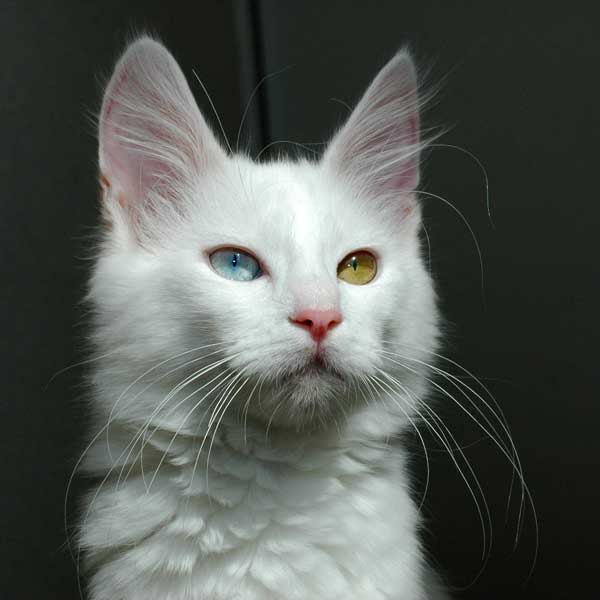
Turkish Angora cats are one of the oldest natural breeds of cat, originating from the Ankara region. It is believed to be the origin of the long hair varieties and the dominant white gene. They are usually white but can be any colour, and can have odd-coloured eyes..JPG/738px-Turkish_Angora_in_Ankara_Zoo_(AO%C3%87).JPG)
Tabby Cats
'Tabby' is not an actual breed of cat. The tabby colouration can occur in any breed, and as a matter of fact most cats possess the gene but do not always display it due to other active genes.Mackerel tabbies have stripes running down their bodies, with the stripes gently curving vertically downwards. Mackerel tabbies are the most common type, and have an 'M' marking on their foreheads.

Classic tabbies have a whirled, 'bullseye' like pattern on their bodies and are usually in browns and blacks but can be grey.

Ticked tabbies have agouti hairs, where the hair pigment is broken up into bands of different colours, giving the coat a 'salt and pepper' look.

Spotted tabbies look exactly like the name suggests: the gene is modified so the Mackerel or Classic pattern is broken up into smaller spots and patches.

Black and White Cats
'Black and White' is also not a specific cat breed. The right term is a bicolour cat, and they are white with patches of other colours or patterns. However for the sake of this poem I will be researching black bicolour cats.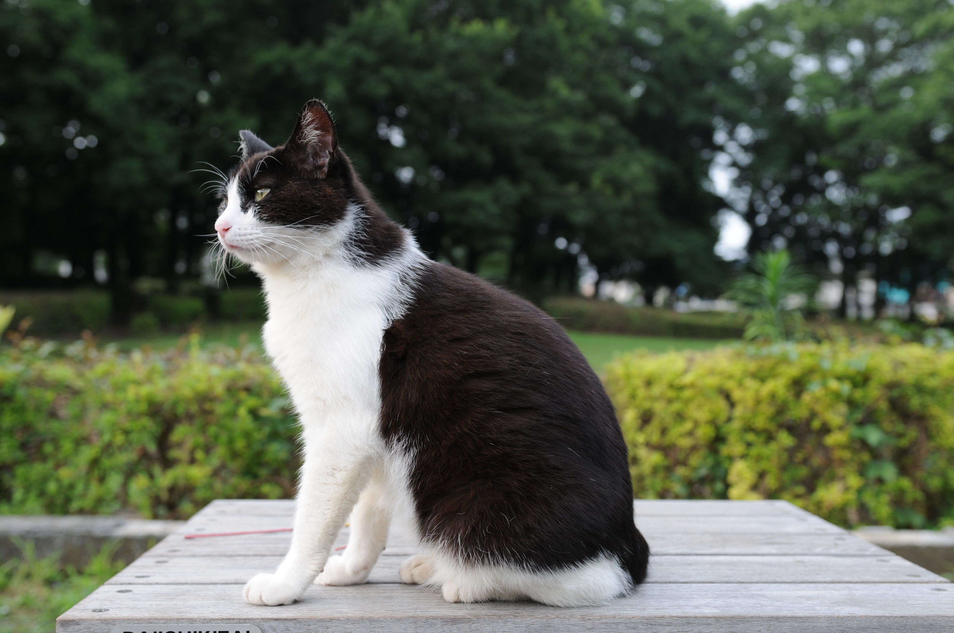
Bicolour cats are graded from 1-10, with 1 being completely solid and 10 being fully white. There are also specific patterns which have popular names, such as 'tuxedo' patterns.

Tortoiseshell Cats
Like the black and white cat, a tortoiseshell is also a type of bicolour cat. However instead of being one colour mixed with white they are usually two or more colours mixed together. Another interesting thing to note is that tortoiseshell cats are usually exclusively female.
Manx Cats
Manx cats come from the Isle of Man in the UK and are typically tailless due to a genetic mutation which was specifically bred for. Sometimes the cats can have a short, stumpy tail.Sunday, 16 February 2014
Black Beauty by Anna Sewell
Black Beauty was one of my favourite novels as a child and in the hardback edition I own I've always admired the watercolour illustrations inside. This book was illustrated by Kate Aldous in watercolour and pencil, in an accurate style with plenty of colour and life.

This was one of the first full page illustrations in the book. As you can see, the use of colour is bright and vivid, and the dynamic composition of the drawing gives it plenty of movement and flow. I love the 'realistic' style of the drawing too, which is something a lot of modern illustrators forego in favour of their own wackier styles.


 These are two of my favourite full-page illustrations in the book. The watercolour paints are the perfect choice of medium for this kind of realistic illustration because although bright and colourful they can also produce just the right tones and colours for human and animal forms. They are a great choice to use for children's books and illustrations because of their friendly, inviting atmosphere.


This was one of the first full page illustrations in the book. As you can see, the use of colour is bright and vivid, and the dynamic composition of the drawing gives it plenty of movement and flow. I love the 'realistic' style of the drawing too, which is something a lot of modern illustrators forego in favour of their own wackier styles.
Another thing I really like about this book is the vignettes in each chapter. There are lots of these throughout the book, both big and small, with some taking up 2/3 of the page like the one above. The text has expertly been moulded around the images and helps to punctuate key points of the text which don't require full-page illustrations but definitely benefit from the extra visuals.
The small illustrations for each chapter title are also features I think work really well in this book and style of illustration. They definitely help to keep the book interesting and engaging for children- the book itsself is particularly long and while I could read it all the way through without losing interesting, I know not every child could and the illustrations definitely spurred me on to read even more voraciously.
Friday, 7 February 2014
Big Book Of Nonsense
Within this module we also have to illustrate one poem from The Big Book of Nonsense by Colin West. The book is a collection of short poems and little rhymes about everything from cats and hats to monsters and misters.


And now some cuteness! Meet Raphael the tabby cat and Leonardo the gingie cat.


The book was illustrated by Colin too so it will be interesting to hear his thoughts on our interpretations of his writing. The poem I chose was 'Good Homes for Kittens'.
The poem is quite simple, made up of six loosely rhyming couplets related to different breeds of cats.
These breeds are:
- Siamese
- Angora
- Tabby
- Black & White
- Tortoiseshell
- Manx
And now some cuteness! Meet Raphael the tabby cat and Leonardo the gingie cat.
Monday, 3 February 2014
Quentin Blake
Quentin Blake is one of England's most well-known and favourite illustrators, and is probably best known for his works in Roald Dahl's books. Over the course of his career he has illustrated over 300 books, of which 35 he has authored himself and 18 that Dahl wrote.
His style is instantly recognisable, because of his messy watercolour and ink medium and scrawly linework, and because of the life and energy he puts into his characters throughout each and every drawing he creates.

This illustration from James and the Giant Peach shows the diversity of each character through the way Quentin has drawn their individual qualities. The grasshopper is clearly the charismatic leader with his prominent position and confident expression, while the rest of the characters are drawn surrounding him, including James and the Centipede.

Although Quentin's characters aren't totally perfect, their messy aesthetics add a quaint charm to the overall image and suit his medium perfectly. After all, how could you be perfectly neat when using ink and watercolour?

This is an illustration from Matilda. Again, Blake has used inks and watercolours to illustrate the image. He must use waterproof ink when drawing because the watercolours do not smudge the line-art.

This was one of my sketches for the animals unit in module 1. It was one of my first tries using watercolour as an actual drawing medium rather than just using it to colour and shade, and resulted in a loose, messy drawing which I actually really like. I think it helps me to identify with Blake because of the messy lines and quick strokes, and because I think it definitely has a cute, charming quality.
Another thing to note is that on his website, in the Q&A section, he is asked wether or not he identifies with his characters while drawing them. His response was interesting to note:
"What you really do when you start to draw is you imagine that you are that person and you go into the reactions you think you would be having. I find myself doing the faces as I'm drawing them."
This is definitely something to try myself, especially considering I really like to draw expressions and there's so much emotion and atmosphere that can be put forward in an image just by facial expression.

His style is instantly recognisable, because of his messy watercolour and ink medium and scrawly linework, and because of the life and energy he puts into his characters throughout each and every drawing he creates.
This illustration from James and the Giant Peach shows the diversity of each character through the way Quentin has drawn their individual qualities. The grasshopper is clearly the charismatic leader with his prominent position and confident expression, while the rest of the characters are drawn surrounding him, including James and the Centipede.
Although Quentin's characters aren't totally perfect, their messy aesthetics add a quaint charm to the overall image and suit his medium perfectly. After all, how could you be perfectly neat when using ink and watercolour?
This is an illustration from Matilda. Again, Blake has used inks and watercolours to illustrate the image. He must use waterproof ink when drawing because the watercolours do not smudge the line-art.
This was one of my sketches for the animals unit in module 1. It was one of my first tries using watercolour as an actual drawing medium rather than just using it to colour and shade, and resulted in a loose, messy drawing which I actually really like. I think it helps me to identify with Blake because of the messy lines and quick strokes, and because I think it definitely has a cute, charming quality.
Another thing to note is that on his website, in the Q&A section, he is asked wether or not he identifies with his characters while drawing them. His response was interesting to note:
"What you really do when you start to draw is you imagine that you are that person and you go into the reactions you think you would be having. I find myself doing the faces as I'm drawing them."
This is definitely something to try myself, especially considering I really like to draw expressions and there's so much emotion and atmosphere that can be put forward in an image just by facial expression.
Contact with Quentin
On Quentin's website there is a link to message him via email. I took this opportunity to send forth a query about his references and reference material, as it could be useful to see where he gets the references for his great dynamic poses in a lot of his images.I also sent him a message through his Facebook page. Hopefully I will get a reply and will be able to update this blog with it!
What
you really do when you start to draw is you imagine that you are that
person and you go into the reactions you think you would be having. I
find myself doing the faces as I'm drawing them. - See more at:
http://www.quentinblake.com/about-drawing/hints-tips#sthash.PLFjvnCk.dpuf
What
you really do when you start to draw is you imagine that you are that
person and you go into the reactions you think you would be having. I
find myself doing the faces as I'm drawing them. - See more at:
http://www.quentinblake.com/about-drawing/hints-tips#sthash.PLFjvnCk.dpuf
What
you really do when you start to draw is you imagine that you are that
person and you go into the reactions you think you would be having. I
find myself doing the faces as I'm drawing them. - See more at:
http://www.quentinblake.com/about-drawing/hints-tips#sthash.PLFjvnCk.dpuf
What
you really do when you start to draw is you imagine that you are that
person and you go into the reactions you think you would be having. I
find myself doing the faces as I'm drawing them. - See more at:
http://www.quentinblake.com/about-drawing/hints-tips#sthash.PLFjvnCk.dpuf
Tuesday, 19 November 2013
jack sephton
Jack Sephton has some interesting reportage sketches. Compared to a lot of reportage, they're very dark toned and almost all of buildings within the city.
He uses watercolour in all of these and changes between ink and fineliner pen.
I like the way the images look as though they've been drawn quickly but the attention to detail is still there in the features of the buildings.
He has also produced some illustrations of birds, again using watercolour and fineliner. I like the contrast within the images and think he's very good at using these mediums. He works in a very similar way to myself, in that I like to first sketch, paint and then refine the drawing with fineliners. However his work is more detailed, especially in colours, shading and in the clearly thought out compositions, and this is something I could try to work towards in my own work (Perhaps in the animals project?).
 |
| image credit to jacksephton.deviantart.com |
 |
| image credit to jacksephton.deviantart.com |
 |
| image credit to jacksephton.deviantart.com |
He uses watercolour in all of these and changes between ink and fineliner pen.
 |
| image credit to jacksephton.deviantart.com |
 |
| image credit to jacksephton.deviantart.com |
I like the way the images look as though they've been drawn quickly but the attention to detail is still there in the features of the buildings.
 |
| image credit to jacksephton.deviantart.com |
 |
| image credit to jacksephton.deviantart.com |
 |
| image credit to jacksephton.deviantart.com |
He has also produced some illustrations of birds, again using watercolour and fineliner. I like the contrast within the images and think he's very good at using these mediums. He works in a very similar way to myself, in that I like to first sketch, paint and then refine the drawing with fineliners. However his work is more detailed, especially in colours, shading and in the clearly thought out compositions, and this is something I could try to work towards in my own work (Perhaps in the animals project?).
RESEARCH ONLY- ALL IMAGES CREDIT TO jacksephton.deviantart.com
alessandro andreuccetti
alessandro andreuccetti has a brilliant web portfolio on his deviantart account, andreuccettiart.deviantart.com.
He also has a lot of reportage sketches on there from his sketchbook, in a few different mediums and styles.
This is ony of my favourite reportage sketches from his gallery. I really like illusion of depth and perspective and the colours and textures he has used in it. The way he has done a relatively simple paint wash background has helped influence my own sketchbook reportage as I've taken to experimenting with different brusho and watercolour techniques to produce a similar effect. I think this style really adds something to an otherwise plain line drawing, and helps add depth of field and a way for my to control the focal point of the piece.
He also has some reportage sketches of people within a gallery.
He uses watercolour paints to add colour and life to these sketches, and he sketches everything from landscapes to buildings and people.
As you can see he has a very good grasp of perspective and the colours he uses to paint these sketches give them a lot of character.
His other works are also exceptional. His colour studies are absolutely fantastic! I love the vibrance of his images, especially the tree and forest studies.
In different mediums he has also done studies and sketches of horses, some in acrylics and some in ink, pen and watercolour combined.
He also has a lot of reportage sketches on there from his sketchbook, in a few different mediums and styles.
 |
| credit to andreuccettiart.deviantart.com |
 |
| image credit to andreuccettiart.deviantart.com |
 |
| image credit to andreuccettiart.deviantart.com |
 |
| image credit to andreuccettiart.deviantart.com |
 |
| image credit to andreuccettiart.deviantart.com |
 |
| image credit to andreuccettiart.deviantart.com |
 |
| image credit to andreuccettiart.deviantart.com |
 |
| image credit to andreuccettiart.deviantart.com |
 |
| image credit to andreuccettiart.deviantart.com |
 |
| image credit to andreuccettiart.deviantart.com |
 |
| image credit to andreuccettiart.deviantart.com |
 |
| image credit to andreuccettiart.deviantart.com |
His other works are also exceptional. His colour studies are absolutely fantastic! I love the vibrance of his images, especially the tree and forest studies.
 |
| image credit to andreuccettiart.deviantart.com |
 |
| image credit to andreuccettiart.deviantart.com |
 |
| image credit to andreuccettiart.deviantart.com |
 |
| image credit to andreuccettiart.deviantart.com |
 |
| image credit to andreuccettiart.deviantart.com |
 |
| image credit to andreuccettiart.deviantart.com |
RESEARCH ONLY- ALL ART CREDITS TO andreuccettiart.deviantart.com
Subscribe to:
Posts (Atom)