Showing posts with label paintings. Show all posts

Tuesday, 19 November 2013

missmessymess

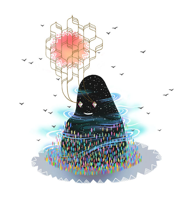
Another deviantartist, missmessymess has an eclectic collection of works, ranging from digital illustrations to reportage done in pencil and other works in acrylic on boards.

image credit to missmessymess.deviantart.com

image credit to missmessymess.deviantart.com - the pencil sketch for the below piece
image credit to missmessymess.deviantart.com
These are a range of her digital works. Their use of colour and texture is interesting, and the subjects painted are really strange and quirky and fit her illustrative style perfectly.
I like the simplistic style of the works- it realls works with the colours and textures and ensures that there isn't an overload of visual information in the picture.

image credit to missmessymess.deviantart.com

Above are a series of reportage illustrations done by her, all based around a pub called '6 million postcards'. I love her way of shading and the toned paper she uses. They give the drawings much more character especially considering that they are pub based and the tones used fit this image. I myself would love to have a toned sketchbook to draw in and would defintely consider making my own- this is partly why I've been colouring my own sketchbook papers with paints and inks.

image credit to missmessymess.deviantart.com

These are her other traditional works. Most of them are done in acrylic paints on boards. You can see her illustrative style coming through in the way the same kinds of colours are used, although the textures are different to those in her digital works.


RESEARCH ONLY- ALL IMAGES CREDIT TO MISSMESSYMESS.DEVIANTART.COM

jack sephton

Jack Sephton has some interesting reportage sketches. Compared to a lot of reportage, they're very dark toned and almost all of buildings within the city.

image credit to jacksephton.deviantart.com

image credit to jacksephton.deviantart.com

He uses watercolour in all of these and changes between ink and fineliner pen.

image credit to jacksephton.deviantart.com

I like the way the images look as though they've been drawn quickly but the attention to detail is still there in the features of the buildings.

image credit to jacksephton.deviantart.com

He has also produced some illustrations of birds, again using watercolour and fineliner. I like the contrast within the images and think he's very good at using these mediums. He works in a very similar way to myself, in that I like to first sketch, paint and then refine the drawing with fineliners. However his work is more detailed, especially in colours, shading and in the clearly thought out compositions, and this is something I could try to work towards in my own work (Perhaps in the animals project?).


RESEARCH ONLY- ALL IMAGES CREDIT TO  jacksephton.deviantart.com


Monday, 18 November 2013

Colouring greyscale bases in photoshop


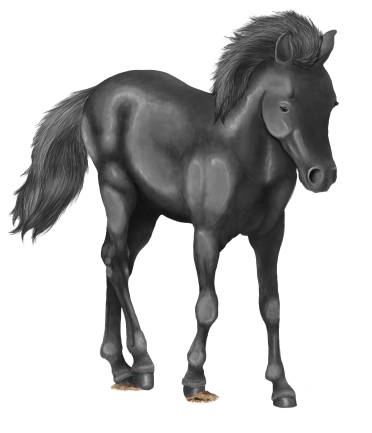
a finished greyscale base
 This is a finished greyscale base I created. I spent quite a while on this, making sure the contrasts were good and that it was detailed properly.

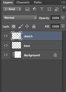
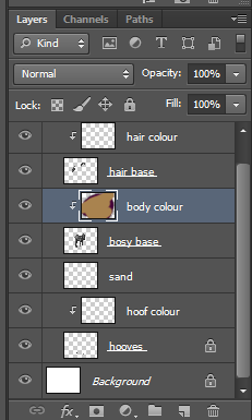
To start colouring it I first make a new layer with a clipping mask for each part of the base- so for the body, hooves and hair. All you need to do to make a clipping mask is check the box for it when the New Layer window pops up.


my layer palette with all the clipping masks added
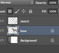
 As you can see in the layer preview window, I've scribbled all over the body colour layer. Because I have a clipping mask added to the previous layer it means that everything on the colour layer will be confined to the space of the base layer.

the result of the clipping mask

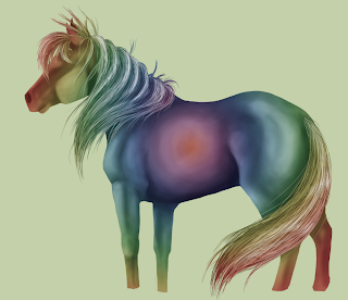
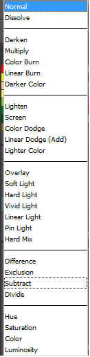
Then to actually use the base properly I change the Layer Style of the coloured layer to 'Soft Light'. There are many other styles to be chosen from however I think 'SL' gives the best balance between tone and colour.

all the layer styles in photoshop
'Soft Light' layer style VS 'Overlay'.
Above is a comparison of two layer styles, 'Soft Light' (which I use) and 'Overlay'. Personally I think the overlay setting makes the colour too saturated- especially when working with brighter colours, and if it looks a little underexposed like the one on the left you can always use the Curves tool to edit the contrast and lightness of the base.

a bay and black tobiano coloured horse
a liver chestnut leopard horse and a RAINBOW PONY :D
With more complex greyscale bases you can build up layers and layers of different colours, however I can work with one layer just fine.

Making greyscale bases in photoshop


An easy way to reproduce the same image in many different colours and patterns is using greyscale bases combined with clipping masks and layer styles over the top.


Above is an example of some tags I've worked on previously using greyscale bases.
As you can see it's easy to make multiple copies with completely different colour values like blue and yellow to more natural colours and variations.

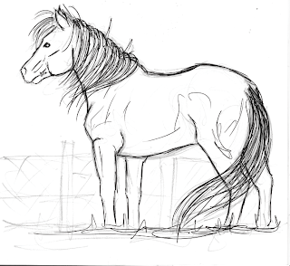
To do this I first scan in a sketch or draw directly within Photoshop. Then I use a small hard brush with 100% opacity and flow with the pen pressure turned on to make a lineart of the sketch (making sure it's on a new, transparent layer).
original sketch


lineart

view of layers palette

After that I colour the base with a 50% grey colour and clean up the edges with a small eraser. Then I lock the layer so when I add tone it doesn't splash outside the clean edges.
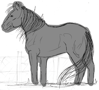
rough base

cleaned up

the locked layer

When I've locked the layer and cleaned up the base I then start adding tone by using a medium hard brush with approximately 15% opacity and 20% flow. This allows me to build up the tonal values smoothly.

brush settings
 When I start to add tone I hide the lineart layer so that I can make a more realistic looking painting, however when I hide the lineart you can see the base has jagged edges which again I must clean up.
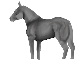
hidden lineart, jagged edges. very rough tone added

From there on out I just keep building up the tone. After a while I also add a clipping mask with a rainbow gradient to check that the tone isn't getting too dark or too light in places. I also start painting the hair at this time. For the hair I use a harder brush with the pen pressure on to first sketch out the general flow and direction of it. Then I use a darker shade of grey to add details, and I use the hue and saturation tool to change the darkness of it until it's at the right point. After completing the hair I use the dodge and burn tool to add shadows and highlights.
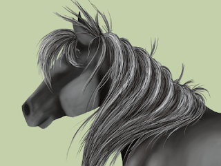

close up of hair
the rainbow gradient to check tonal values
When it's finished I can start adding colour using layer styles. There will be another post soon about this!


Tuesday, 8 October 2013

Experimenting with watercolours pt 2- drawing


So after I did some washes in the pages of my sketchbook, I did some drawings over the top.

I wanted a way to experiment with colours and I thought this would be the best way to do it as watercolour paints give bright colours and complimentary washes and can be used quickly and easily. 


This background was a mix of watercolour paints and soft pastels. I have been trying to match the colour to the subject as best I can, if that makes sense- so the earthy tones of this background fit the stag drawing on top of it. 


This was a redraw of a life model sketch. I used fine liner to draw it again because I thought it looked really sharp against the painted background.

A few more examples of drawings with. colour backgrounds:


These next ones were done with ink and brusho: 


De Goya


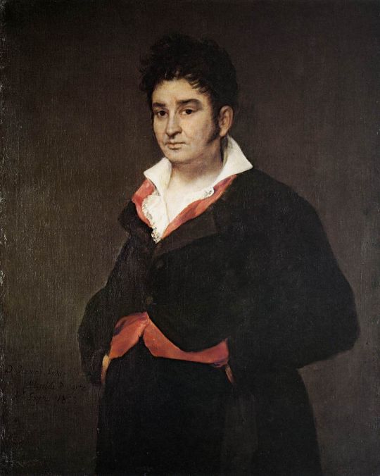
De Goya was a Spanish romantic painter who gained recognition by painting portraits. However he was known for painting people realistically, without flattery as other artists and painters were wont to do at the time. Goya became the court painter to the Spanish Crown and remained so throughout the Peninsula War, staying in Madrid where he painted a portrait of Joseph Bonaparte (right).


Most recognisably he painted the series 'The Black Paintings', which were named and collected posthumously and featured some of my favourite works such as Saturn Devouring his Son and Two Old Men. One of the main reasons I love his work is because of the way his paintings are so dark and grim; even his portraits use dark colours.


Saturn Devouring his Son- image credit to wikipedia.org


However what I think really sets the Black Paintings apart from his other works is the way he uses the paint- his portraits were very lifelike and smooth, whereas the Black Paintings were very loose and rough, with huge brushstrokes and loads of texture.

Goya painted the Black Paintings in the midst of mental illness, and he painted them directly onto the walls in his house after the Napoleonic Wars. This meant they were on massive 'canvases' and I think it's really awesome that he painted them so big inside his home.


image credit to wikipedia.org


This is the painting Two Old Men. As you can see it's painted in the same rough style as Saturn Devouring his Son, with similar colours and a dark background with the subjects popping out of the image.

I think this is an effective way of drawing attention to the point of the painting and is a really good way to show gruesome and harsh figures.