Showing posts with label mark making. Show all posts

Tuesday, 11 February 2014

Life Drawing 10/2/14

For the first time in a while we finally had a female model to draw. Again I made a concious effort to break away from my usual pencil/fineliner sketches and used a lot more varying techniques.


First sketches with pencils. 3 minutes each. 


In this sketch we had 3 minutes to draw the model using straight lines. My approach to this was to use a magenta felt tip to draw lots of small straight lines. However I wasn't very pleased with the result, it was harder to get down a good draught of the model and so some of the proportions were off. If I tried this again I would probably try it with a medium that could be built up in layers such as charcoal or pencil. 


This was an experiment I liked slightly more. Instead of drawing with only straight lines, in this I used flowing, bubbly circle lines. Again I tried a felt tip, this time choosing a blue one because bubbles remind me of the ocean, and I thought that the way I could build up the density of the circles was a great way to discern areas of light and shadow. 


And then this was my favourite of the three line experiments. Again using felt tip, choosing a navy blue, this was a continuous line drawing that I actually really liked. Usually I'm not the biggest fan of line drawings as I'm more accustomed to using small sketchy strokes but while I was drawing it I thought it almost looked like a puppet doll with the separations at each joint like the elbows, knees and shoulders. After that I tried to keep the rest of the drawing in the same vein and I feel really happy with the outcome. 


This was a drawing with a dark charcoal pencil. After drawing out the figure, I added some tone using the charcoal pencil and smudged it with my fingertip to add a softer touch. Although unfinished I think the tone adds a lot of depth to the image and I like the expression the model is holding. 
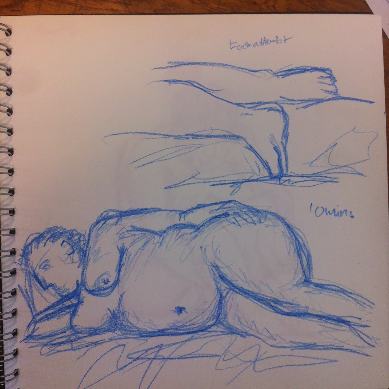
 

This was a drawing with coloured pencil. I find coloured pencils a lot different to regular pencils to draw with in that they tend to wear down a lot quicker and it can be hard to get a fine, sharp point. However this was a coloured pencil drawing I liked (apart from the feet and head) because I took my time with this and carefully added lines and small areas of tone. I tried to draw the feet more closely because they were at an odd angle but I don't feel I was successful with this because I couldn't quite get the foreshortening on the feet down properly.


Throughout the longer poses I moved around to be able to capture the same pose at different angles. Again using felt tip, I thought this was a decent attempt at the angle because the foreshortening of the body can be quite difficult to get right. 


Then I tried using some A3 size paper instead of my usual square sketchbook. For this drawing I used graphite sticks, a 2B and a 9B. I used the 9B to sketch out the general figure and too add tone, while the 2B was used to draw details and strengthen lines. 


Again I used graphite for this drawing, however I only used the 2B for the face because the 9B was too soft to record the details properly. This was my favourite drawing of the session because I think I've got the anatomy of the model down accurately and I really enjoyed working larger with the graphite. 


Then when I had some time left over I tried drawing with fineliner. It took me a little longer to get to this stage than with the graphite as I had to think more about where I would put my lines and how strong they should be at each part. Even though I didn't finish it I'm happy with the progress I made in regards to drawing with fineliner and I will definitely try it again.

Monday, 10 February 2014

Life Drawing 3/2/14

Last Monday we had our first life drawing session of the module, drawing a male model we have previously drawn in another session.


This was one of the first sketches I did in this session. In the previous module I used a lot of the same materials and techniques so this module I'm trying to branch out a little more, hence the orange pencil. This sketch definitely isn't the best of the session, it was more of a warm up drawing to loosen up. 


In this sketch I used a 0.3point fineliner and a green and blue pencil to add areas of tone. I always dislike drawing poses like this because I always feel like they never turn out well. I find it hard to draw the angles and curves. 


This was another experiment with adding tone using coloured pencils. I quite liked this and would have liked to finish it, although he looks like a green human-slug thing in this pose which I find moderately amusing. :D


 I liked the odd angle of this sketch. I thought I tackled it well and recorded the anatomy of the model properly considering the awkward shapes the face makes in this position. Used a 3B pencil.


I also drew a close-up of the models foot. Feet are interesting to draw because they can be so different (and disgusting!). Here I used a 0.2point fineliner and a 3B pencil to add some tone to the foot as the way the tendons in the foot cast interesting shadows was something that I really wanted to practice recording. I really liked this sketch, it was definitely one of my favourite, if not because of the subject but because of the technical aspects.


Here I used a pencil for the main drawing and then a graphite stick to draw the close-up. Recently I've been finding myself having time to spare after each sketch so I've been taking it upon myself to draw little extra bits to keep it interesting. I think it's interesting how there isn't much difference between the two mediums in the photograph but in the actual sketchbook you can see the differences in texture. 


Throughout our lifedrawing sessions I've done quite a few drawings with my left hand. Although it can be quite difficult to control the medium with my left hand, I've found that the chunky graphite sticks produce a really good drawing like the one I did in this session. I think because the graphite is thicker than a pencil or pen it's easier to work with and I think that a lot of my left handed drawings have tons of character and life to them. This one almost looks Neanderthal with the hunched back and vapid expression (no offense to the model!).


This was a sketch from memory. For the 2 mins allotted I did not look at the model at all- before drawing we were allowed 2 minutes to look at the model and take in their features. I thought I did really well with this, the only problem I had was with the angle of the arm and the charcoal pencil I used was a great way to add hints of tone and muscle. 


This was my favourite exercise of the session, as we were to draw a portrit. Well for me, I love drawing people, which is why I enjoyed it so much. However I did want it to be a little different so I again used a green pencil.


Tuesday, 8 October 2013

Experimenting with watercolours pt 2- drawing


So after I did some washes in the pages of my sketchbook, I did some drawings over the top.

I wanted a way to experiment with colours and I thought this would be the best way to do it as watercolour paints give bright colours and complimentary washes and can be used quickly and easily. 


This background was a mix of watercolour paints and soft pastels. I have been trying to match the colour to the subject as best I can, if that makes sense- so the earthy tones of this background fit the stag drawing on top of it. 


This was a redraw of a life model sketch. I used fine liner to draw it again because I thought it looked really sharp against the painted background.

A few more examples of drawings with. colour backgrounds:


These next ones were done with ink and brusho: 


Friday, 27 September 2013

Experimenting with watercolours (pt.1)


To increase the variety inside my sketchbooks I've been experimenting with ways to pre colour the blank pages.

A fun way of doing this has been to use watercolour paints to wash over the pages in different colours.


For these colour washes I simple used a wad of wet tissue and brushed it over my paint pallets, then scrubbed it across the paper. 

 My watercolour palette and tissue used.


I quite liked this soft colouring effect and thought it was a good way to create atmospheres in my sketches- for example I would use a duller, more muted wash for maybe a drawing of the beach we went to, or maybe I could do someone's favourite colour underneath a portrait of them to give the piece some more personality.

On another page I also splattered some paint onto the page and smudged it with my hand.  I quite liked the way it looked and think it will be interesting to see how sketches on top will look. 


Another thing I experimented with was different brush edges and shapes. Usually I would use a flat square brush to apply colour however for the next two washes I tried a fan shaped brush, shown in comparison to the square brush below.


This was the result of the fan shaped brush:


The fan shaped brush made streakier strokes and I thought looked quite good when applied with a dark colour on a lighter background.

The last way of applying watercolours that I tried was doing a dark grey wash on a page and then using crumpled tissue to lift some of the pigment from the page, which resulted in this smoky, foggy appearance:


I think this kind of background will be good to use in the future because it's got a quieter, more subtle texture than some of the other ones I tried.