Friday 27 September 2013

First portraits


In our welcome week, on the Thursday we had a session drawing each other's portraits in different time limits.

The first exercise we did was to draw our hands three times in different poses.


That was my first drawing of the day, and this was the third hand drawn: 

This time I drew it in pen to make it different to the first hand, although I preferred working with pencil because it feels a lot more natural to me as one of my most used tools.

Then I started working on a portrait of Matti, however I didn't particularly like the results as I didn't think they were properly accurate to the way he looks.

Then I scribbled over the surface of my page and sketched Fiona from the course.
I didn't mind this effect but would have liked a little longer to work on the actual portrait.


The next exercise we did was drawing within a shape. I didn't like the profile drawing of Callum I did but I thought the 3/4 view of Sean was quite good. 


Then I went outside to do a few sketches around the campus. I used a softer pencil to sketch the tree below and was quite pleased with the result- usually I struggle drawing trees but I think I drew it accurately and I especially liked the leaves!


The penultimate drawing of the day was a scene sketch of a bench and it's surroundings. 

I liked this drawing too and thought my sketches were improving throughout the day. The proportions of the scene look okay to me and I think I captured the angle of the bench well. :) 


My final sketch was of classmate Tom Lewis and our tutor Ben. I was happy with these because I think I've drawn Tom's expression well and the general figure of Ben looks well in proportion and scale.
Experimenting with watercolours (pt.1)


To increase the variety inside my sketchbooks I've been experimenting with ways to pre colour the blank pages.

A fun way of doing this has been to use watercolour paints to wash over the pages in different colours.


For these colour washes I simple used a wad of wet tissue and brushed it over my paint pallets, then scrubbed it across the paper. 

 My watercolour palette and tissue used.


I quite liked this soft colouring effect and thought it was a good way to create atmospheres in my sketches- for example I would use a duller, more muted wash for maybe a drawing of the beach we went to, or maybe I could do someone's favourite colour underneath a portrait of them to give the piece some more personality.

On another page I also splattered some paint onto the page and smudged it with my hand.  I quite liked the way it looked and think it will be interesting to see how sketches on top will look. 


Another thing I experimented with was different brush edges and shapes. Usually I would use a flat square brush to apply colour however for the next two washes I tried a fan shaped brush, shown in comparison to the square brush below.


This was the result of the fan shaped brush:


The fan shaped brush made streakier strokes and I thought looked quite good when applied with a dark colour on a lighter background.

The last way of applying watercolours that I tried was doing a dark grey wash on a page and then using crumpled tissue to lift some of the pigment from the page, which resulted in this smoky, foggy appearance:


I think this kind of background will be good to use in the future because it's got a quieter, more subtle texture than some of the other ones I tried. 

Apofiss (deviantart)

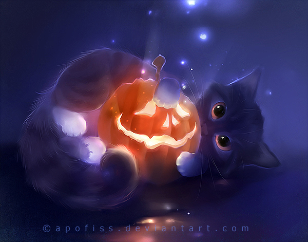
Apofiss is a popular digital artist I found on deviantart.com.
Why are they so popular?
This is why:

Image from apofiss.deviantart.com


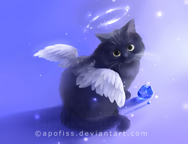
They paint the most ridiculously cute cats EVER!

Using mainly digital media including Paint Tool Sai and Photoshop, their work is characterised by soft colours and even softer brush strokes to create a warm, cosy atmostphere in their paintings.
They do a lot of work by commission through deviantart for many different customers and they have also uploaded tutorials to help other artists hone their digital skills!

image from apofiss.deviantart.com


In this commission to the left you can see the similarities in style with the above image. The commission was for another deviantart user and is one of their most popular works on their page.


Apofiss also paints a range of other subjects other than cats, from humans to other animals and popular characters and even still life.

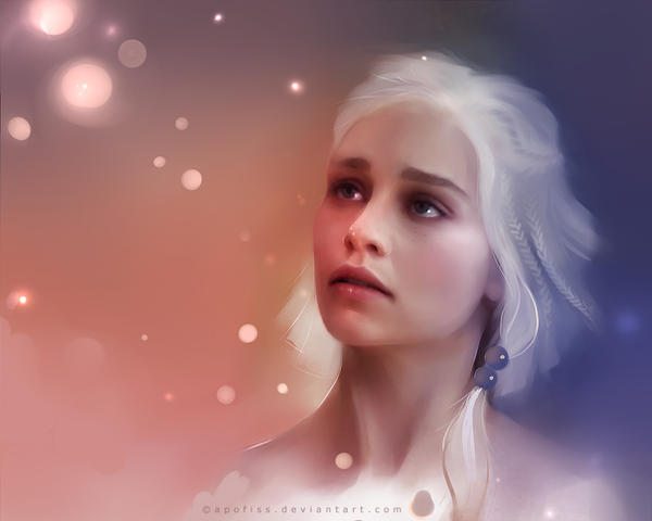
'Khali'- Danaerys Stormborn from A Game of Thrones (Season 2)- image credit to apofiss.deviantart.com


In these other works Apofiss also shows a higher technical ability than in the previous images- in this portrait especially they have done well to capture lighting effects and the features of the subject well- while still keeping their style firmly in place. The soft waves of this subject's hair is similar in the way they paint fur, and the background shares the same subtle effect his other works do.


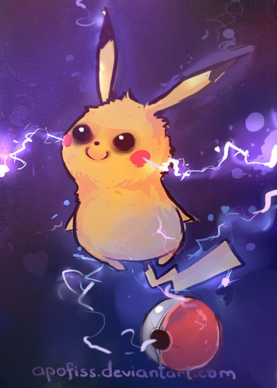
'pikacharge'- Pikachu painting- image credit to apofiss.deviantart.com


Apofiss also uses characters from popular franchises as subjects, such as this Pikachu from Pokémon.
Although this painting does not look like their typical style, there are still some staple similarities between this and their previous images. These can be noticed in the way the face and expression of the subject have been drawn (a cute expression is reminicent of the cat paintings) and the brush strokes throughout the piece and in the background have been seen consistently in their works.


Wednesday 25 September 2013

Fritz Eichenberg

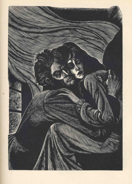
Fritz Eichenberg was a German-American illustrator whose main medium was wood engraving. Throughout his prolific career as a book illustrator he worked with many different kinds of literature but specialised in material with elements of fantasy, spiritual and emotional conflict and social satire. He illustrated authors such as Charlotte and Emily Bronte, Poe and Grimmelshausen.
Image
Heathcliff and Catherine. Wood engraving for 'Wuthering Heights' by Emily Bronte. Photo credit to theartofchildrenspicturebooks.blogspot.co.uk


Fritz Eichenberg is one of my favourite illustrators because his style is so dark with huge dramatic shadows, and I love the crazyily detailed mark making throughout his pieces. This gives a subtly shaded effect which I think looks great. I've experimented with lino printing in the past which kind of reminds me of this style of work, just not as delicate, so I think it would be fun to try and do something similar to this. I could even use white pencil on black paper to try and imitate the way his images look.

Brett Helquist

Brett Helquist is an American illustrator who works primarily on children's books and graphic novels, although recently he has delved into the realms of comic books too.
Perhaps most famously he illustrated the popular book series 'A Series of Unfortunate Events' by Lemony Snickett.
'The Grim Grotto' image credit to www.bretthelquist.com

The above book cover for the eleventh book, The Grim Grotto, I feel has a distinctive style and the style fits the series well. I've admired Brett's quirky illustrative style for years now and I can really appreciate the way the images perfectly narrate the book contents. His use of colour is usually quite sophisticated with a complimentary palette- for example The Grim Grotto features plenty of harmonious greens and blues, perfect for the sea-based book.


               Image
'Climbing the rope' pencil illustration. Photo credit to www.bretthelquist.com
The illustrations inside the books are usually pencil sketches like Climbing the Rope. I really like the way Brett uses cross hatching and other pencil marks to suggest texture and tone. I also like how sharp his images are- they're mostly neat with lots of textured detail which makes for an interesting illustration with lots of eye catching focal points.

the beginning!

Hey guys!

Welcome to my blog :)

So, a little bit about me:
I'm 18 and living at home at the moment to save money for a MA. I'm a total bookworm and avid gamer, with my favourite game being World of Warcraft (!) however I don't play at the moment because I'm just way too busy :(

I like an eclectic mix of music, anything from rock and indie to rap and pop, with my fav bands including Interpol, The Editors, Alice in Chains and Public Enemy.

Here's a few examples of my past work:

A mixed media collage of Charles Darwin: On the Origin of Species

Another mixed media collage inspired by the Picture of Dorian Gray for a live brief. 

An observational drawing in chalk and charcoal.

 A pencil illustration of a blue jay bird on a blossom branch.