Friday 31 January 2014

Illustrator Styles

Throughout the last brief I had a lot of trouble trying to find and solidify my 'style'. I felt like I didn't really have a style like other illustrators do, where it's so obvious that their work is their own.


Above are some examples of Alphonse Mucha's work. These pieces clearly show all the definitive markers for his style, such as a muted but harmonious colour palette and patterned borders around the images. Beautiful women with flowing hair, often wearing neo-classical robes and holding bouquets of fresh flowers are another staple in his commercial works. All of these features together pinpoint his particular personal style.

Because I like to draw quite realistically, I felt as though I didn't have a style and this presented a few problems to me in that I didn't really know how to define my possible future illustrative voice. I was confused as to how I could present my style of drawing in a way that could become unique to me and me alone, because there are a lot of other artists out there that can draw realistically and I didn't want to be one of the same.

Therefore I will first be researching other illustrators that have a fairly realistic, true-to-life style to see what seperates them from the crowd and to try and inspire me to find my own discerning flair.
However, a few people I know mentioned they thought that my drawings and illustrations reminded them of vintage, old-style, almost Victorian-era type illustrations so I think I'd like to research this kind of illustration too to see if it gives me any good ideas!


Thursday 30 January 2014

The Witches

In the end I decided to choose to illustrate The Witches.

Having chosen The Witches, which is one of my favourite childhood books, I think that the audience this book is aimed at (primarily children- although I know a few adults that enjoy this book too!) will be an appropriate genre for my style of illustration.
Through some recent self-exploration I've come to the realisation that my 'style' is quite true-to-life; it's mostly realistic when compared to many children's book illustrators who twist things into their own styles and proportions.


For example this is a children's book cover illustrated by Nick Sharratt, who has illustrated most (if not all) of best-selling author Jacqueline Wilson's books.

The style of drawing is very particular in its' features, with the girl's face having attributes which are commonplace in all of Sharratt's drawings, such as simplistic details (especially in the hair) and not following the basic anatomical proportions of the body.


This is my current style of illustration, as you can see it is a lot more true to life (although obviously not photo-realistic) but there is enough detail involved to be able to say this is a realistic style. I can definitely develop this further throughout this brief and see if there are any little quirks or flairs I can experiment with to give my work its' own unique qualities.


I think that my style is appropriate because although a lot of illustrators have an unrealistic style there is still a market for semi-realistic illustrators. Most children's books or novels with realistic illustrations tend to be books based on animals, such as the Warriors series by Erin Hunter or the classic Black Beauty by Anna Sewell, and in The Witches, mice and other animals are prominent figures throughout the book which is why I feel like the book is a good fit for my style.

Wednesday 29 January 2014

Overview of Book Choices

These were the final books I'd chosen to read:
  • Animal Farm, George Orwell
  • Wuthering Heights, Emily Brontë
  • Hansel and Gretel, The Brothers Grimm
  • The Witches, Roald Dahl

Synopsis of Animal Farm

'Old Major', an old boar living on the farm, brings the farm animals together for a meeting, discussing the parasitic qualities of the human and teaching them a song called 'Beasts of England'. Shortly after Major dies, two younger pigs take charge of the animals and lead them to revolt against the drunk farmer Mr. Jones, renaming the farm 'Animal Farm'. They create the 'Seven Animal Commandments', of which the most important is 'All animals are equal'. Eventually the pigs raise themselves to positions of leadership and start setting aside special items and luxuries for themselves.

Towards the end, the commandments are abridged to just 'All animals are equal, but some animals are more equal than others' and the animals realise they can no longer distinguish between the pigs and humans as they start to walk upright, wear clothes and carry whips.

I thought the book was very well written, and although it's a shorter story than most it encorporates a lot of very powerful allegories which is something I really like about it. However I'm not sure I will choose to illustrate this book because although I enjoy drawing animals and people, I feel like I won't be able to really push the boundaries of my style with this book and it might become a little bit boring if working on it for a long period of time.

Synopsis of Wuthering Heights

The story begins with a man named Mr. Lockwook acquiring residency at Thrushcross Grange, owned by Heathcliffe. After being stranded at his landlords home (Wuthering Heights) and then reading about a woman named Catherine with multiple surnames, after which he has a nightmare featuring this woman. Upon returning to Thrushcross Grange, he enquries about the mysterious Heathcliffe and his history to the housekeeper there, Ellen.

Ellen then narrates the story of Wuthering Heights, from the arrival of Heathcliffe as a child to Catherine's marriage to Edgar Linton and her subsequent death. Then she continues the story until the present day.

The main theme of the book, I would say is of extreme jealousy and revenge, however the book was narrated in a very boring way with little in the way of descriptions or, in my view, highly important events that really had an impact on me as a reader. I doubt I will choose to illustrate this and found it quite disappointing because it's such a well-known classic and it just didn't live up to my expectations.

Synopsis of Hansel and Gretel

Hansel and Gretel is the story of the two children of a woodcutter and his wife (their stepmother). The family was starving and the stepmother cruelly persuaded her husband to leave the children in the woods to fend for themselves, where it was likely they would starve to death or be eaten by the wild animals within the wood. The first time they were left, Hansel had cleverly dropped white pebbles on the way into the woods so they were able to find their way home again.

The second time, however, Hansel had dropped breadcrumbs which were eaten by birds. Unable to find their way home, the children wandered through the forest and eventually found a wonderful house built from sweets and gingerbread. A little old woman greeted them and fed them a nice meal that night, however in reality she was a wicked witch who plotted to fatten and eat the children. After locking Hansel in a cage and fattening him up, she would have eaten him if Gretel had not pushed her in the oven which she was baking bread.

Free from the witches clutches, the children chanced upon a trove of gold and jewels in the witches house, and they found their way home where their father was overjoyed to have his children return to him, and his wife had died while they were away.

This was always one of my favourite stories as a child. I really enjoyed reading this, and although there are many variations and re-writes of the story at various times I am confident after many cross-referencing that the version I have found is the original (published 1812). This could be a good choice for me, as I'm familiar with the story and children's book illustration is a possible career pathway in my future so it would be good to experiment with this sooner rather than later.

Synopsis of The Witches

 In the introduction of the book, the narrator reveals the world of witches to be a secret society plotting to rid the world of children.

The boy in the story becomes orphaned when his parents die in a car crash, and so he moves to live with his grandmother who tells him many stories to help him get over the grief. His favourite stories told by her are the stories of the witches, and she tells him of 5 children she knew that had been affected by the witches. She tells him all the ways to spot a witch, and warns him to be careful of them.

The grandmother falls ill and so they cannot travel to Norway for the summer as planned and instead go to a beachside resort in southern England. The boy, playing with his pet mice in the hotel ballroom, gets locked inside the room while a meeting of women takes place. This turns out to be the annual witches meeting of England, and he overhears the Grand Witch's plan to eradicate every child in England using a new concoction, the Formula 86 Delayed Action Mouse-Maker, which will turn people into mice after a set amount of time! The forumla is proved by its experimentation on a boy staying in the hotel named Bruno, a greedy boy which the Grand Witch lured in with the promise of chocolate bars.

The boy gets found by the witches in the room and they turn him into a mouse too, however he manages to escape and tells his grandmother all about their wicked plan. And so they form their own plan in which they will turn all the witches into mice themselves and thus will get rid of all the witches in England!

This was always one of my favourite Roald Dahl books, alongside James and the Giant Peach. I would really love to do this book although it will be a challenging pick because Quentin's illustrations are so iconic and prominent in the books of Roald Dahl. This is the main factor dissuading me from choosing this book but because it's one of my favourite books I would really like to illustrate it and I think it would keep me entertained for the full brief with this. There's a lot I could do with this in terms of experimentation, as the main issue for me will trying to avoid being over-influenced by Blake's illustrations.

Tuesday 28 January 2014

Module 2- Narrative Illustration

As of last week we started our second module, narrative illustration.

Narrative illustration is the practice of drawing from text- reading a passage or book and then coming to an illustrative conclusion from the descriptions and your own ideas and thoughts in relation to the text.

At the beginning of the brief we were given a book list to choose from.


This was my copy of the book list.

When I first looked over it, I just marked the books I would possibly interested in with a hyphen after the title.

I first marked books that I either had read before or was familiar with the story.

After reviewing my initial choices, I then marked off the books I would actually be reading. Although I hadn't picked Wuthering Heights initially, I thought I would read through it anyway as it's such a classic I thought it would be an interesting read. The Witches, Hansel and Gretel and Animal Farm are all very familiar to me which was my main reason for choosing these books.


Friday 3 January 2014

Digital Manipulation- final pieces 3 & 4

The second half of my submission for Digital Manipulation were two mixed media pieces. They both started off as digital sketches, and then I printed them and painted over them to eventually edit them in Photoshop.

This was my favourite piece out of all of my final images. I used a mix of watercolour and brusho paints to apply the colour and then edited and cleaned up the image in photoshop. This is my favourite because of the momentum and flow in the image- I feel like it has a big presence and a lot of energy which is something I admire in other equine artist's work. 


As my fourth and final image, I thought this was a good attempt at changing colour and playing with contrasts in Photoshop.

Digital Manipulation- final pieces 1 and 2

For our Digital Manipulation unit we were to produce 4 final images.

 
 This was my first final image for digital manipulation. I spent quite a lot of time on this image, digitally painting it by starting with one base colour and then building up the shading and highlights from there. To get the white patterning I used a clipping mask over the colour layer and added the white where I wanted too. I locked the layer when I was satisfied with the shape of the patterns and then shaded them according to the rest of the body.


My second image had a similar approach to the first, although I specifically spent a lot less time on this one. I began in the same way by drawing some lineart and then colouring in the base. However this time I only added light shading and highlights, and I tried a different technique of colouring the hair all together. Instead of building up the hair with lots of layers of separate strands, I instead coloured different 'chunks' of the hair in different shades. I prefferred this image to the first one, mainly because I think the colours are a lot more complimentary to each other and I liked that I didn't have to slave over it for hours on end to produce a good end result.

People and Characters exhibition

Our exhibition for the People and Characters unit within our module was a collaborative exercise, and I worked in a group of 6 including myself.

In my group were:

Emma Barnes
Callum Griffiths
Thomas Williams
Tom Lewis
Sean Miller

We had a really large space of wall to fill and so we needed a substantial piece to cover the walls. Because the exhibition was SUPPOSED to be based on the people within Hartlepool, we decided to go with a sea theme, featuring a power plant and landfill area polluting the sea. Towards the left of our panel we planned a fisherman sat on a pier, fishing out bottles containing characters of present and past times from Hartlepool.

Progress Pictures


We used a variety of different mediums in this mural. The sea was a mix of acrylic paints, and the acid cloud was watercolour and ink. The sky was done with soft pastels, and I used a few different grades of pencils to shade the fisherman. We also hung monoprints of bottled characters a long the pier which gave our colleague Alan a way to thread our works in together by using his string to make it look as though they were hanging properly!


Thursday 2 January 2014

My own Reportage

These are some of my own reportage sketches from my own sketchbooks, where I've experimented with different techniques and tools.

Life Drawing


These sketches are from our life drawing classes included in our module.


This sketch was a quick, 30 second drawing with a 3B graphic pencil. I thought these types of quick gesture sketches were quite important in helping me perfect a quicker technique which will be important in regards to reportage I may do in public where people will not be posing properly, and of course if I choose to report moving vehicles it would be even more important.


This was a 2 minute sketch. I liked it because I thought I captured the expression of the model well, reminding me of some of Michelle Bedigian's reportage of people because of the angular facial details. 


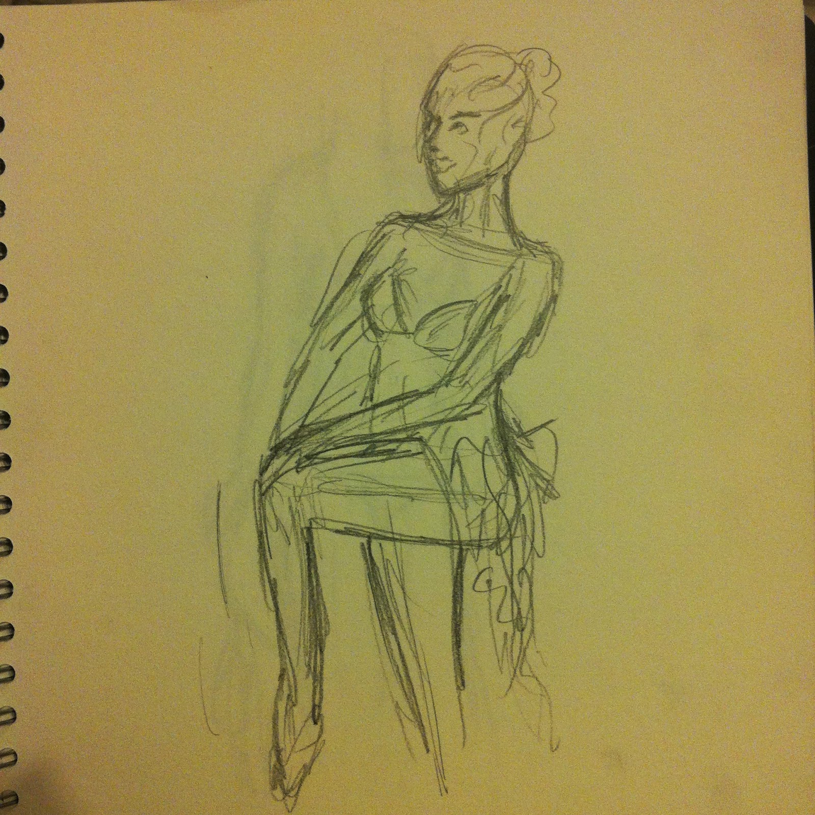
This was one of the longer poses we did. I didn't really like this one as I thought her body was a bit distorted but I thought it was a good attempt as it was a difficult angle to draw. 


Another 2 minute sketch. Over the life drawing session I got more to grips with sketching quickly and so it was easier for me to sketch general poses.


A 5 minute sketch from our session. I actually thought this session was a little boring because our model was so concerned with looking 'fat' her poses were very static and unemotive, meaning my sketches weren't as characteristic as I would have liked. This sketch in particular was one of the more rigid ones that I disliked the most.


I liked this drawing more than most. After doing a more detailed sketch in pencil I rotated my sketchbook and drew another ontop using conté crayons (on dry paper). The pencil sketch underneath helped to make the second one a lot more interesting and added another layer of depth to the image.


I was pleased with this sketch because the foreshortening on the arms and legs is quite good. I used a softer grade of pencil (9B) which added a fuzzier effect to the sketch but I kind of liked this as it added a softer atmosphere to the drawing.


One of the exercises we were told to do was to pile 3 2 minute detail sketches on top of each other. This was an exercise I really hated because to me it had no use- why draw three detail sketches when you won't be able to see the detail properly because they are squashed together?


After the life drawing session we were able to draw from our sketches and refine them if we wanted. I chose to try drawing over the top of a toned background using a 2B graphite stick and then added tone to the drawing itself using different grades of pencils. 


This was a sketch I liked because of the colours I used. I experimented with some soft pastels in this drawing session and although I didn't like the process of drawing with them I liked the end result. The edges of the pastels wore down too quickly which was something I didn't like. I think this kind of media would be better suited to either bigger pieces or soft shading. 


This was another exercise where I had to draw poses one on top of another. However I liked this one a lot more because there was a lot more space on the page and the actual drawings are a lot bigger. I also liked the way the blue and pink pastels on the last drawing helped it stand out from the others.


The last drawing from this series is one I experimented with ink with. I thought the ink would add some drama to the piece but I didn't like the end result. I didn't have much control over the way the ink went on the paper and that was another thing I didn't like- I'm used to using pencils and crayons more which obviously allows a lot more control over the way the medium is used.


In my second sketchbook I painted a lot of the pages with vegetable oil to produce this tranclucent effect. I really liked this because the sketches on the next page could be seen underneath!

I split this page into four so I could draw the four poses quickly and easily. This page was a warm up page, which I can see clearly because I feel as though these sketches are not of the same quality as the later ones. I used a 3B pencil which was fast becoming my favourite drawing medium.


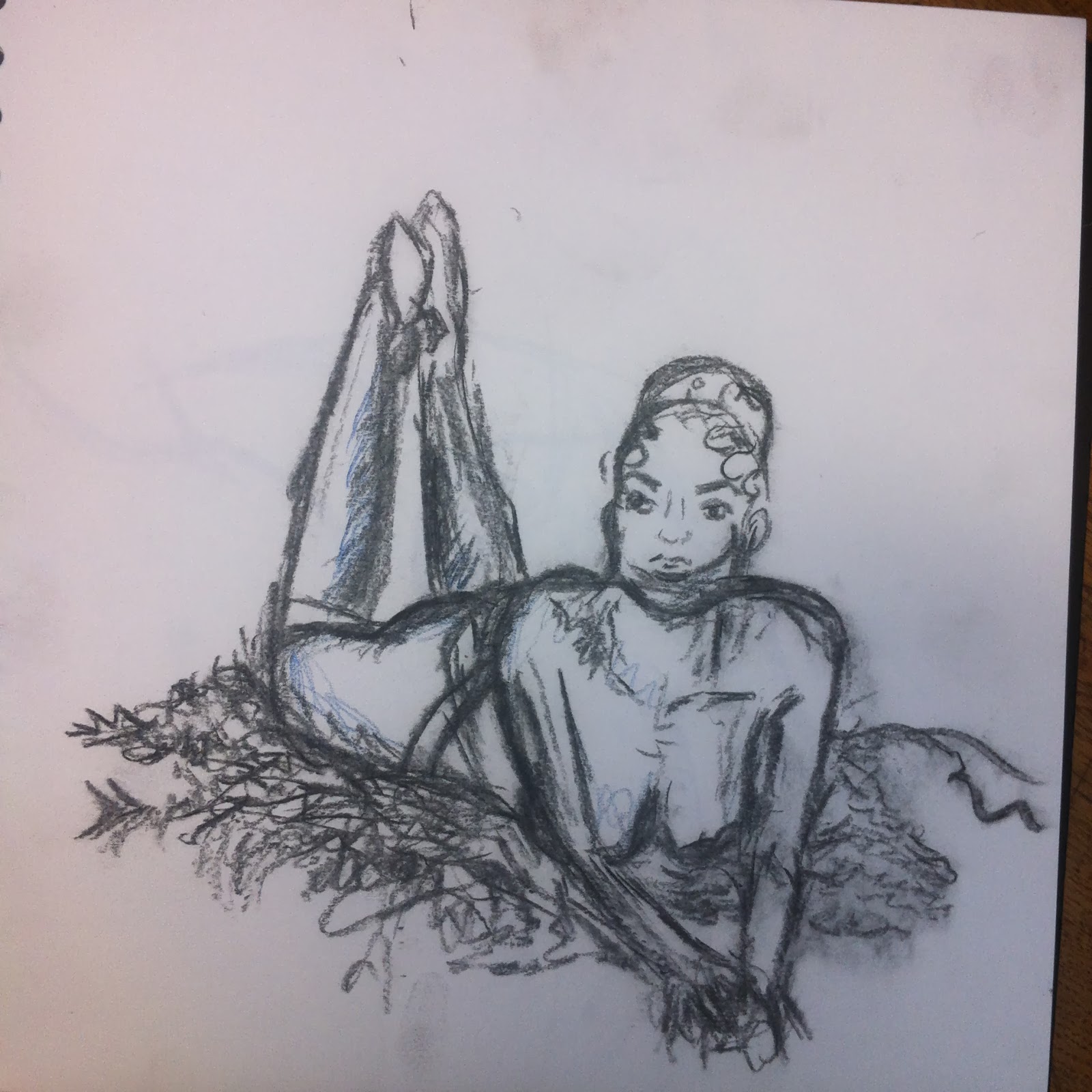
This was one of my favourite sketches, because the way the model was laid out on the duvet was a hard angle to draw and I feel like I successfully captured the foreshortening of the limbs. The tone I added was also helpful in adding to the three dimensional feel of the drawing, making it look more realistic. 


 I liked this sketch because of the illusion of movement it contains. It was a slightly longer sketch maybe 3 minutes and this allowed me to spend a little longer studying the anatomy of the model when she moved.


 This was another page with multiple sketches on, like the earlier ones I did. Again I liked this better than the detail one because I was able to fill more of the page with each drawing and rotate my sketchbook to produce a more interesting composition.


In this I drew one side of the model with my left hand and the other side with my right. I also tried to match the pose the model was in to the shape I had painted the oil on the page. I did this in a number of ways to make different 'windows'  in the sketchbook pages. 


This was a page of sketches drew with my left hand, and then with my left hand without looking at the page as I drew. Although I wasn't impressed with the right hand drawing, I actually quite liked the left one, as I thought the line was quite good and gave the figure a good form.


This next series of sketches is a mixture of our two male models. In this sketchbook, the pages were painted beforehand and so were a bit more interesting to draw on. I tried to match the mood of the pose with the colours of the pages- so for this one, I matched the sombre pose with the cool blue-green background.


 I liked this sketch because I thought it was an interesting pose. I sketched it quickly with a lighter grade of pencil, as I thought my usual 3B would look a bit too harsh next to the soft pastel background of the page.


This was a page I didn't like much in terms of aesthetics but in technique I thought was useful. I didn't think much of the pencil over the red background as I thought it got lost a bit in comparison, but the contrast between the red brusho and blue pencil is something I really liked. 


I tried using watercolour as the sketch medium on this page, because I didn't want to use pencil for fear it would become lost against the strong background. I used a black paint and actually quite liked drawing with it- it wasn't too hard to control like I expected and it looked good with the background.


 This was one of my favourite pages in this book. I really thought I captured the anatomy of the model well, and the slight tone I added looked really good, especially with the light background giving the sketches some contrast.

Because we were alloted a time of 10 minutes for this particular pose, I decided to spend the time doing three separate drawings from different angles of the pose.


 In this one I swapped the pencil I was using with a paint brush pen my friend Liam was using. I liked using the pen because the blue looked good on top of the reds and oranges, and it was interesting using a new medium I've never tried before. I would probably have liked a little bit longer to experiment with the pen, but I can maybe do this in another session.


 On this page, after drawing the profile view of the model laying down, I changed my medium again to the blue pencil and moved around the room to try and find a more interesting angle to draw at. I was really pleased with the drawing of the feet I did, because the foreshortening was a difficult thing to report properly but I think I captured it decently.


This was another interesting page for me. Although I wish I had used a darker medium to make the drawing stand out more, I especially liked the background of the page and I started adding a little tone to the drawing which I thought made it look even better. The tone added another layer of depth to the drawing and really helped the details to stand out. 


This was another of my favourites, mainly because I loved the background so much. I also liked the contrast of using a fineliner pen instead of a pencil. I think the drawing itself could be a lot better but I thought I made a good effort on a difficult angle.


Out and About 


A quick sketch in the park. Fast, scribbly mark making technique.


The same as the previous drawing. I like this because of the perspective of the subject.


A portrait of my friend also sketching at the park. Tried to fit the drawing in with the oil 'window' I'd painted on the page.


Used the oil 'windows' to add colour to certain details of previous page in the sketchbook (the next image). Felt tip pens. 


This sketch was also drawn around a 'window'. As previously mentioned I did these in lots of different shapes on each page. 


This sketch was drawn with a dark charcoal pencil.  I liked the charcoal pencil because it provided a nice contrast against the light paper and it was easy to smudge a little to give some tone.


Again I used the charcoal pencil. I drew this horizontally so that the landscape would fit with the paint across the page.


In this sketch I tried adding a bit of colour, but because I had added oil to the page to make it translucent, the pigment did not take well and I didn;t want to use felt tips like I had before because I thought they would look a bit too bright in the image.


This was a sketch I spent more time adding tone to than most of the others I've done.  Adding tone can really help give a drawing some depth!

This was a very messy ink drawing I tried. I actually used a stick to apply the ink, which made it difficult to achieve smooth lines because every few strokes I would have to dip the stick in the ink again. I probably wouldn't try this again because to me the result looks pretty amateur and there are other mediums I can get better results with. 
 

This was a drawing I did using blue chalk. The chalk pastel was different to softpastels and conté in that it went on the paper more smoothly although it wore down even quicker than the other two pastels I've tried. The colour was quite nice, although it looks a bit scarce on its' own so if I tried chalk again I would probably try to add some other colours or mediums in with it.


I also experimented with using black sketchbook paper. To make the drawing medium stand out more I again put other colours on top of the paper. On this page it was yellow chalk. I drew over the top of it with a dark charcoal pencil which I thought looked really nice. The chalk gave the image almost a weathered look.


I also used watercolour paints to paint over the black paper. Most of the reportage in this book was drawn on the train home from uni. I liked using the dark charcoal pencil the most with this paper because it stood out a lot more than regular pencil. 


I also used some graphite in this book. The graphite stick is an interesting medium because it has very reflective qualities, as seen in the way the light is shining on the media in the picture. This was a reportage sketch of my (messy) desk at home. I drew it because I've been drawing a lot of people and it's important to draw man made forms too. 


This sketchbook was my smallest one. I drew in it with a 3B pencil and tried to spend no more than 2 minutes on each piece. 


Yet again I coloured the pages of this sketchbook, and in this one I used chalks. The chalk had a strange texture to draw on, and it didn't really work with pens as the dust would coat the nib and not allow any ink through. 


More reportage on the train.


My friend Richard. I've been having trouble drawing faces from profile so this was useful practice for me.


To fill up the smallest sketchbook which had had pages ripped out of it, I cut some coloured card out to the same size and drew on those.


 In this sketch I used darker pencils of 9 and 7B to add darker tone. Although I was pleased with it as first I actually now think it looks a bit messy and smudged, which can happen when using softer pencils.


I enjoyed doing this reportage of the messy cafe. It was quick and easy to do and I could make use of a scribblier technique.


After drawing the initial sketch, I painted over this image in watercolour paints and then used fineliner to outline it. Then I used my calligraphy pen to add the text detail.


These last three images are some of my earliest reportage, of the beach in Hartlepool.

In this one I found it hard to get the perspective and proportion right of the pipe and rocks.


The perspective of this one was also quite hard to get right, although I thought it looked quite good when finished, especially with the darkened lines to separate the segments of path.


This was my best image of that reportage session. I enjoyed adding some detail onto the rocks, and drawing Tom. In case you haven't noticed I enjoy drawing people the most, even the backs of their heads, and this was some good practice for me.