Saturday 27 September 2014

Vinyl Cover Research (3)

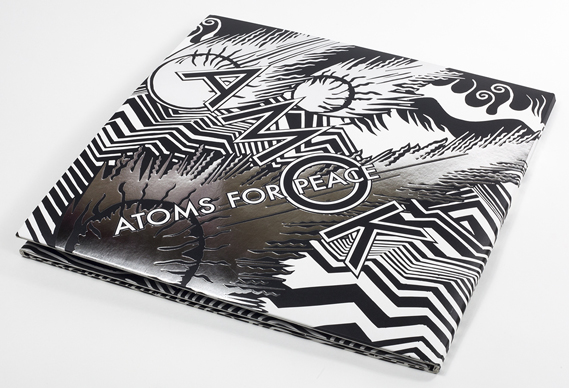
When browsing through www.creativereview.co.uk  I found another album design which really did catch my eye. Designed and illustrated by Stanley Donwood, it of course features the iconic style he is renowned for, and features silver metallic flashes to emphasise the title typography.


Now, this type of illustration isn't my style, but I can appreciate the technical ability that comes into this. I can also appreciate the spectacular Limited Editions of this album (in both CD and vinyl), with its (again) concertina folds showcasing a full spread of Donwood's intricate work.


The illustrated spread shows a post-apocalyptic scene of the Hollywood hills. Quite fitting then, for an album named 'Amok' by a band called 'Atoms for Peace'. This shows that a certain synergy between album and artwork is needed to draw the audience in, especially those that would be interested in purchasing a collectors item such as this. 

Although my album packaging probably won't span the same length as this I think I definitely want it to have a decent amount of image space. In this design the title text is merged with the illustrations but this isn't really my style of doing things and so I would need either a clear space or a separate canvas entirely to house the text. 

(all images credit www.creativereview.co.uk )

Vinyl Cover Research (2)

Another vinyl cover I found really intruiging is this one from band 'Cave Painting'. The album was "inspired by Japanese paper engineering and binding techniques"[1]. 


 At first glance the album does look stylish, with the white background contrasting sharply with the diamond in the center. Opening it up, however, shows a fantastic concertina fold with each page colourfully gradiated and a different cut made in each layer to put together the diamond you see on the outside.


 The vinyl cover differs from the CD cover, but not by much. The thoughful design is still present just manifesting in a different way- a pattern of die cut shapes show the inner sleeve underneath, giving an animated effect when removed. 


Again, although this is something I find creatively inspiring I'm finding it hard to figure out a way to connect it with the album I'm doing now. Somehow I need to make my own visually engaging packaging, combining all the aspects of the concept I have and of the illustrations I create for it. 


 (Images from www.creativereview.co.uk  )
[1] Gavin Lucas, www.creativereview.co.uk, visited 27/09/2014

Vinyl Cover Research (1)

So after some initial research into the depths of the internet, I found some exotic examples of creative vinyl packaging. This design was the first that caught my eye because of the impressive origami- yes, this 'sleeve' is composed of screen printed, origami folded paper.


At first glance it may not even seem like a vinyl cover. The paper is folded in a way representative of a birthing flower and reportedly was supposed to portray the feel and atmosphere of the music inside.


The paper cover gives a hand crafted feel, with attention to detail all over the octagonal origami. 
I like it because it's so different- how many mainstream artists go the extra mile to ensure their work is so totally different from anything else? I don't know but what I do know now is that it's entirely possible to make a feasible design from the simplest of materials. 

At this moment I'm unsure as to how this inspiration could come across in my work, but I'm toying with the idea of possibly using some type of printing in the packaging. Possibly it will only be for the title or some effects but who knows yet. 


Initial Album Packaging and Merchandise Ideas

So, I've been looking at producing this edition of the album as a 12" vinyl, mainly because they are bigger which gives me more room to wiggle in in terms of design and packaging. However I also wanted to view this project as producing a limited-run of this particular design, and I thought a vinyl would be something more distinct than a typical CD, especially in that serious music collectors often have record players and, more to the point, record collections. I also think a really outstanding vinyl has way more 'Oomph!' than a titchy CD!

For this reason I wanted to design the packaging as something different, not just a record sleeve or something that opens out. I'm also considering making a prototype for this though, so it must be feasible in means of production and printing.

Merchandise is something almost every single music artist has as part of their package now, whether it be cool, grunge-rock t-shirts and tote bags to cutesy comfy pillows with Elton John's face on. Iggy already has a range of merch including t-shirts and totes (of course!), along with a cloth fan, temporary tattoos, patches and artsy nail stickers. Therefore I don't really want to do something similar to these, they've been done before and it would be easy to make the mistake of creating something identical.

Ideas I'm throwing around at the moment include her own actual fashion range, maybe some provocative bikinis or swimsuits (sex and erotica are often underlying in her lyrics although not something I want to focus on too much), instead of the cookie-cutter t-shirts and hoodies with a logo on that she promotes at the moment. A make-up range could appeal to her female fanbase, however some market research would be needed to be able to make a definite decision on this.


Thursday 25 September 2014

The Concept

The concept behind my work for this album is the ideal of the 'American Dream', focusing on the high-class and very fashionable era of the 1920s- 30s (think 'the Great Gatsby' with a more modern perspective).

The Great Gatsby, F. Scott Fitzgerald, Vintage Classics cover 2013 [1]

My reasoning behind this is that this era was very much focused on wealth and the things that often go with it, i.e. fast cars, fashionable clothes and well-furnished homes. The general ethos in that time was that with enough work, even more determination and just a pinch of luck was that you could achieve the unachievable; incredible success for you and your family in 'The Land of Dreams'.
Iggy herself journeyed to America in pursuit of her own aspirations, and the story of this is well interwined in the lyrics, going hand in hand with her tales of new found fame, money and access to the world of fasion and luxury.

Another constant allegory within her songwriting is the determination to have a booming career. Running along the same lines as that is that she possesses some lone wolf qualities enabling her to work without distractions and hindrances. This is something I'll definitely try to convey in what I create although exactly how I'm not sure yet. This is where research comes into play as now I need to research typical items associated with all of these themes. By using research I can really dig deep into my concept and get the work spot on.

Concept Mind-Map

As mentioned previously, this is the mind-map I made using the most important theme buzzwords.


 As seen in the map, everything I've deducted links to the most common theme of wealth.

Wealth is a result of a successful career because of the determination she writes about. This is because she puts in a lot of hard work, which again directly results in an abundance of money. Wealth also is a factor in living a high-class, luxury life which gives her access to the expensive fashion she obviously admires. The 'lone wolf' in her comes as a consequence of her drive and need for success, and so linking it to her career as a contributing presence.

These kinds of deductions give me the foundations of a really solid concept. A mind map like this allows me to think more about the direction I want to go with the idea, and I can always use it as a reference to go back to when I need to bring new thoughts into it.

From here I will finalise a concept and explain the process behind it thoroughly and how I will use it in my work.