Throughout this module the brief specified that we needed to create pretty much a full package for an album released on CD or 12" Vinyl, and we would need to form a concept we could show through our work.
The album I chose was Iggy Azalea's 'The New Classic', released on 21st April 2014. I analysed each song separately so I could glean as much information from them as I could- after all the lyrics and my interpretation of them is what would provide the basis of my concept.
After analysing the lyrics the main themes I deducted from the album were money, wealth, fashion, class and success with some sexual undertones. The album also had a kind of American Dream/ rags to riches vibe too which was something I thought I could capitalise on. Iggy moved from Australia to the US to find her fortune and so far it's paying off, and she can actually now get these things she wanted so much growing up. From this I had the idea of incorporating an Art Deco theme into my work because her journey to the US took her to the city of Miami, well known for its Art Deco architecture and influences, so it would be the perfect fit. This also allowed me to explore options within typography and graphic design I otherwise wouldn't have had the chance too.
During this project I undertook a lot more research and did a lot more analysis than I have previously; I literally have not stopped updating my sketchbook with more research as and when I've needed it. This is something that hasn't really been a problem but can be a bit annoying when I'm ready to dive in headfirst. I think a good way to avoid this next module would be to list exactly what I need to research for each image- most of what I needed to do were for things like the car and buildings, so things that aren't the main focus but do form a large chunk of the illustrations.
I expanded my methods of research to not just include the internet, I made much more use of the library during this project and it has really paid off. A lot of my ideas came from flicking through library books and the ones with images I found most inspirational were the ones I photocopied and placed in my sketchbook, so I could reference them wherever I was and not just when I was at a computer. I find the library a lot less intimidating now and it's easier to search when you have a little more experience in doing so, which is where I fell down last year. I found a lot more information than I expected which was a nice surprise and this new knowledge can also potentially help me in my academic studies.
I kept my concept consistent during the project which took a great deal of pressure away from me. Again, last year this was an area I didn't really keep on top of my work and attitude suffered as a result. Consistency is key to success, especially in this line of work as everything should be part of a prior development, not just whipped up at the last minute because 'it looks nice'. To avoid this, recently I've been trying to incorporate some symbolism into my work, some things obvious and some more subtle. Colours were used frequently as indicators of status during this project, especially with the heavy use of gold, yellow and blue, all rather harmonious colours with generally positive personalities; gold for wealth and fortune, yellow for happiness and blue for calm and confidence.
My process during this assignment has developed rather rapidly and I'm definitely improving the technique the more I use it. I've been drawing in almost a Grand Theft Auto/ comic art style with emphasis on lineart and compositional dynamics, but with my own way of colouring and shading. I've kept true to the usual Art Deco symmetry, but this is something I like to employ in my own work anyway so it was fun to design something I didn't have to constantly worry about in terms of composition and content.
In my sketchbook I would start by doing some preliminary sketches, spending maybe 30s at the most on one. From there I would chose between one and three different thumbnails to start refining, and then I would choose the one I thought would work the most. Using my research as reference has been really useful and something that's really contributed to what I feel is the high standard of my work for this module.
After finalising the pencil sketch I'd scan it in and open a new Photoshop document (in the right size and format) and start drawing over the main lines with a black Brush tool. I always make sure the 'Pen Pressure' option is on because when using this with a tablet you can achieve realistic, tapering brush strokes. Then I would colour and shade the image, do any last tweaks, add or take away text and in general make sure it's up to par.
The hardest part of this brief for me was trying to get my head around the vinyl templates. To design my own was fairly easy but it felt like I wasted a lot of time searching for one online that had three panels, and maybe next time I would choose a CD because the packaging was too big to print A1. I couldn't change my idea to be a CD cover because then I would need to change a lot of my images and concepts for them- but it is definitely something to think more about next time instead of just instantly proclaiming I know exactly what to do.
This project has been what feels like a total turning point for me. Compared to last year I've grown a lot more confident about my work with much less doubt clouding my mind. I trust in my own ideas and sketches which is an important aspect of the job because without any confidence you'll probably never be able to approach big names appropriately. What I love most about this new process is that I can use both traditional and digital medias, and that I can go in a few different directions digitally from this. I still want to work in game splash and concept art but this style would definitely be something I should try to keep improving.
Making the packaging was something I really enjoyed doing. It was nice to be able to hold something physical I had made with my own hands and to see it displayed with the rest of my images. This project was good for me in that it really needed to make me think about the way the work should be delivered and how I can use line, type and ornaments to tie different elements under one branch together.
The most important conclusion of the brief though is that I am never as organised as I think I am. This module I kept an academic diary with 'mini-deadlines' for myself but that pesky thing called life got in the way sometimes and I couldn't stick to it as strictly as I wanted too. It was a massive help though and really helped me get myself together to create such Fancy work; last year I was all over the place really, and just scraping by. This definitely wasn't the way I wanted the rest of my career to be so that was when I started organising myself and just simply getting on with it.
Tuesday 4 November 2014
Photographs
Photographs of finished album art:


These photos were taken with my mobile phone as it was the only camera I had available at the time, however when my bay is set up with everything displayed properly I'll be using my Canon DSLR to take professional looking photos to use in my portfolio.
These photos were taken with my mobile phone as it was the only camera I had available at the time, however when my bay is set up with everything displayed properly I'll be using my Canon DSLR to take professional looking photos to use in my portfolio.
Product Voucher
Because I was taking this project as designing a full limited edition package for the album, I would definitely want the fans to be able to receive a piece of the specially designed merchandise.
The problem with this is that I couldn't just go for a one-size-fits-all approach and I couldn't put just one of the bikinis free in there...
Dilemma!
However I soon came up with a solution.
Instead of physically receiving the suit straight away, the product would come ready with a one-time unique voucher code enabling the buyer to one free bikini/swimsuit of their choice.
I LOVED this idea because it means that people would be going to the online store which would have other merchandise people might want to buy at the same time. So there could be a potential rise in all round sales as a result of an increase of website traffic.
I also used this as an opportunity to print the 'peacock' pattern I designed for the swimsuit on here, too. I've used the pattern constantly throughout the vinyl packaging, the product, the poster and now this. Combined with the instantly recognisable border and typography I think it makes for a more interesting voucher ticket and it definitely pushes the brand even more!
Vinyl Template
There are plenty of website with free templates to download of anything from CD's and DVD's to Vinyl covers. However every one that I found was only designed for a one fold, two side packaging. This was difficult because I had designed mine to have three panels, so I needed to design my own packaging for this.
The way I wanted it to be laid out would be so that on the front is the album title 'The New Classic', the same as the box. On the back would be the caravan illustration and underneath the album title page would be the song list and credits.
This would be opened to reveal the full three page spread.
An easy way to do this was via Photoshop; I couldn't make the cover at full size because I physically couldn't afford a forty pound print out so I reduced the size to 50% (scaled).
Therefore the packaging would need to be 6x18" for the exterior, and then three separate images for the inside illustrations.
When I printed the template, I used my own initiative to cut the tabs and stick it all together to form the prototype. I placed the tabs on the top and bottom of the left and right exterior panels, and used the scalpel to score the places I needed to fold so that I would get a sharp edge. The building panels had just one tab on the outside edge to create a pocket where the poster, fashion illustration, bikini voucher and other bits and bobs would go.
The way I wanted it to be laid out would be so that on the front is the album title 'The New Classic', the same as the box. On the back would be the caravan illustration and underneath the album title page would be the song list and credits.
This would be opened to reveal the full three page spread.
An easy way to do this was via Photoshop; I couldn't make the cover at full size because I physically couldn't afford a forty pound print out so I reduced the size to 50% (scaled).
Therefore the packaging would need to be 6x18" for the exterior, and then three separate images for the inside illustrations.
 |
| Full Exterior Spread |
 |
| Full Interior Spread |
 |
| Vinyl Template |
Poster Design


I chose the end result because I thought her eyes look like they're boring straight into you, and the text is in a place where it's easy to notice and read but not obstructing any detail or colour.
Poster Development pt3
In my mind, the pose I always think of when I think of 'sass' and attitude is with hands on hips, looking defiantly at you with sultry eyes and a set mouth. I realised that this would be the perfect statement for the poster- with her feet apart and her eyes piercing the viewer it would attract many viewers especially with a black and white colour scheme.

The first sketch I did was really quick, just to get the feel of the pose down first. Then I started refining the image more and more until it was both anatomically, proportionally and realistically accurate. As usual it will be scanned and completed via Photoshop.
The first sketch I did was really quick, just to get the feel of the pose down first. Then I started refining the image more and more until it was both anatomically, proportionally and realistically accurate. As usual it will be scanned and completed via Photoshop.
Poster Development pt2
After fully realising my idea I started to draw some figures and poses Iggy could be in. I wanted her to look sassy and confident, oozing sex appeal and a rock hard attitude.


I really wasn't sure on how she could be standing. I did like some of the poses from the top page but because I already sexualised her figure in the vinyl packaging I didn't want to do that again and turn the selling point to the sexual attraction, and not the music anymore. I would have used the bottom page's left hand drawing but after starting to refine it I realised it looked far too similar to Natasha's fantastic work, so it needed to be different.
I really wasn't sure on how she could be standing. I did like some of the poses from the top page but because I already sexualised her figure in the vinyl packaging I didn't want to do that again and turn the selling point to the sexual attraction, and not the music anymore. I would have used the bottom page's left hand drawing but after starting to refine it I realised it looked far too similar to Natasha's fantastic work, so it needed to be different.
Poster Development

This was my page of quick initial poster thumbnails, experimenting with different poses, content and composition. I wanted something that was really bold and eye catching, like the album packaging, and I wanted the focus to wholly be on Iggy.

I selected the poster with her standing confidently in the middle as the one to develop. I started playing with some different ideas here, even considering drawing a portrait/bust of her, but seeing as her bum is part of her 'image' and what definitely helps sell her music, I thought it was important to include that. I then had the idea to leave the background completely white, and to have the decoration black on white like the packaging.
I also know that I want the suit that Iggy wears to be in colour, along with her hair and lips- small features I can colour that will be focal points for the audience. I didn't colour it fully because I just wanted to hint at colour- I wanted people to get a surprise when they open this vinyl expecting some black and white type and instead they get a spread of golden illustrations.
Vinyl Sleeve Interior- Final Illustrations


These were the final outcomes for the illustrated interior of the vinyl packaging. Using the same process throughout this module has really paid off as I'm starting to see a definite 'style' emerging- or at least a clear way of me to work through things to produce images I actually like.
I used a consistent colour palette throughout the three images so as to make them look like part of a set. I thought it was especially important for them to have the same decorative panel at the bottom, which was something I brought forward from the exterior of the packaging too.
Refined Centre Illustration

This was the final design for the central panel. I wanted Iggy to be sitting on the car bonnet in a very powerful position because she really rules the roost now she's come out all successful and famous. The pose is sexualised but this helps to embody and symbolise the dominance she has over the world, and more importantly the total control she has over her own image and her own music.
I tried to keep to the same symmetrical format as the exterior panel and I'll again be including the sunburst design, this time indicating that the wealth and good fortune was indeed bestowed upon her and will stay for plenty of time to come.
Refined Building Panels
From the previous thumbnail, I was able to really specify the way I wanted the panels to look. I used a similar composition in both of them so they would appear to mirror each other when the packaging was opened.

When drawing these I did my best to be as accurate as I could, using a ruler and guidelines to draw the images. This was just to give myself a helping hand because when using Photoshop to finalise the images I'll be using a lot of guides to ensure it's totally right. I deliberately designed the two panels differently from each other but I tried to use the same general shape in the design as a whole.
Another subtlety is the inclusion of a slightly phallic symbol in the left drawing. I included it because her work is very sexual and raunchy, with lots of swearing and suggestive dancing and posing. Fans leaning on the slightly younger side of the range (17/18) may not 'get' it straight away but her more mature audience (19-25) would probably look at it and smirk when they got the connection. I think it helps show that for all it's glamour and class, the album is still a rap and hip hop album where the music is generally aiming to be offensive, or at least to provoke a reaction of some kind.
Refined Thumbnails
From doing all the research I needed, I was able to sketch the image thumbnails more accurately.

Motor Research- pt2

This was my last page of motor research. Instead of scribbling a drawing down I took my time on this one and really tried to capture the look of the 1920s vehicle. Although I do like this drawing I think it's the wrong shaped car for this particular cover- a more robust looking shape would look better because it would be just as bold as the rest of the image. A square or other rhomboid is a much more powerful shape than something with curves.
Motor Research- pt1

Plain black, white or silver is not something I think Iggy would use; her outfits are almost always vibrant and colourful with clashing accents and neon detailing.
On this page were the very first car sketches I did. The shape of the cars are quite elegant, curving into a gentle wave along the bottom and extending upwards into a canopied roof and huge windshield.
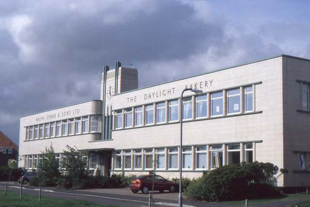
Architecture Research- pt4 + Summary


The research I gathered was really helpful; I can now say with confidence that I can easily recognise, and draw, Art Deco buildings. A lot of buildings have a strong symmetrical element of some kind and many are tall buildings, reaching right up to the sky.
Windows are often placed in unusual positions (offset to the left or right, maybe) and were sometimes circular- stained glass design was popular (something I researched at the beginning of the brief) and so were decorative wrought iron gates and window shutters.
There is often a strong diagonal orientation in the design, with lots of triangles and angles used. Lots of perpendicular lines are used in conjunction with the floor and give a striking effect when paired with the strong symmetry.
 |
| geograph.org.uk |
Just over the road from my estate is an old bakery that has been converted into chic modern flats.
The Daylight Bakery is a unique speck of classic Art Deco design in Stockton-On-Tees and even better if that it's just around the corner. I was able to do a long reportage study of the bakery and spent a lot of time refining it until it looked just so. Of course it isn't a perfect representation but I think I made a pretty good attempt at it; I think the opportunity to draw from an authentic source that is a specific part of my brief is fantastic and enabled me to really get a feel for Art Deco design.


Architecture Research- pt1
I used various books from the library and sources from the Internet to research a broad range of Art Deco design and architecture. Although my concept is specific to America, I also took to researching worldwide Deco (especially Europe, the birthplace of Art Deco) to help broaden my general knowledge of the style and how I could draw it accurately.


Vinyl Sleeve Interior- Initial Thumbnails


Then I had the idea of making the images three totally separate illustrations; I would keep the building concept but just execute it in a different way. I decided I would draw Iggy in the middle on the car (as stated before) but the buildings would be drawn in two point perspective and showcase the gorgeous Art Deco style of New York and Miami.
Vinyl Sleeve Illustration- Exterior Final Image
After gaining a new boost of inspiration from my research, I dived straight into the final image armed with my graphics tablet and Photoshop.
The outcome was similar to the fashion illustration in terms of line quality- I used the same technique of using the brush tool with pen pressure on (instead of using the Pen tool or other) and consciously tried to connect them in this way.
There was a different in the way I coloured it though; I took a gradient-utilising approach for much of the background so I could achieve a smooth transition of tone throughout. I like painting in Photoshop but for this brief I wanted to keep it looking modern and pop-like, instead of an authentic painted look.

At this point I started trying to incorporate some symbolism in my work. For example, I've used fairly dull colours for the majority of the background (excluding the sky/horizon). This is because I wanted it to look like the was coming out of the old into the new; the caravan park is boring now but on the horizon is a golden sun and a joyful land, promising fame and fortune. This is also the reason I coloured her suit in such a precious peacock blue and shimmering gold- she stands out like a diamond in the rough in her original environment.
The sunburst on the horizon is a popular feature in many Art Deco works and was used to signify power, good luck, and rebirth. In this piece I've used it as to symbolise good luck and also wealth; the golden colour is reminiscent of precious metals and jewelleries. I'll be keeping it as a constant theme throughout the illustrated interior to really drive home the concept behind it, and to connect all the images even more tightly.
The outcome was similar to the fashion illustration in terms of line quality- I used the same technique of using the brush tool with pen pressure on (instead of using the Pen tool or other) and consciously tried to connect them in this way.
There was a different in the way I coloured it though; I took a gradient-utilising approach for much of the background so I could achieve a smooth transition of tone throughout. I like painting in Photoshop but for this brief I wanted to keep it looking modern and pop-like, instead of an authentic painted look.
At this point I started trying to incorporate some symbolism in my work. For example, I've used fairly dull colours for the majority of the background (excluding the sky/horizon). This is because I wanted it to look like the was coming out of the old into the new; the caravan park is boring now but on the horizon is a golden sun and a joyful land, promising fame and fortune. This is also the reason I coloured her suit in such a precious peacock blue and shimmering gold- she stands out like a diamond in the rough in her original environment.
The sunburst on the horizon is a popular feature in many Art Deco works and was used to signify power, good luck, and rebirth. In this piece I've used it as to symbolise good luck and also wealth; the golden colour is reminiscent of precious metals and jewelleries. I'll be keeping it as a constant theme throughout the illustrated interior to really drive home the concept behind it, and to connect all the images even more tightly.
Grand Theft Auto Research
When I started colouring and lining the vinyl illustrations, I wanted to replicate the line quality of the fashion illustration, as well as the soft colours and bold type.
I've been a gamer all my life and watched my dad play video games too. From this I've had the chance to see a wide array of game related artworks; everything from sci-fi and fantasy to manga style art and hyper realistic works. One that stood out to me really clearly in my memory was the art of the Grand Theft Auto games, with San Andreas and Vice City at the forefront.
 Looking at the artwork above and below, it's easy to see how with my current process and style I could relate my work to the GTA art. What I like most about the piece is the dynamic line qualities and glowing skin, with a subtle background and a piercing expression.
Speaking of technicalities, it's most likely that these works were finished digitally, in Photoshop or some similar program. I say this because of the lineart and the shading- shading that looks almost like cell shading but also has soft edges and some gradients where needed. The crisp vector outlines of the background also suggest a digital edge- digital work is known for being ultra sharp.
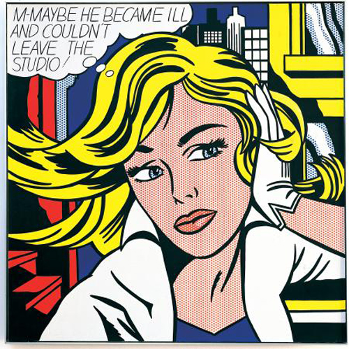
A possible influence of this style could be the Pop Art movement of the 70s, pioneered by the likes of Roy Litchtenstein and Andy Warhol. Roy Lichtenstein actually did create some album covers in his unique style, as shown below.
Looking at the art side by side, I think the biggest influence has been in the form of the lines. Lichtenstein used thick, bold strokes to encase his characters with a more delicate touch on the face and hair. A lot of Lichtenstein's paintings had backgrounds of buildings and cities, and I think look great when combined with the bold lines and vibrant colours.
Another staple in Lichtensteins style is a varied and dynamic perspective. The crop of the images, usually focused right on the subject, is intense and powerful and immediately draws your eye to the centre. When browsing the work of GTA, I noticed that these artists also made works with the same whirlwind atmosphere, as if the subjects could walk right off the canvas.
All artwork belongs to respective owners and is for research purposes only.
I've been a gamer all my life and watched my dad play video games too. From this I've had the chance to see a wide array of game related artworks; everything from sci-fi and fantasy to manga style art and hyper realistic works. One that stood out to me really clearly in my memory was the art of the Grand Theft Auto games, with San Andreas and Vice City at the forefront.
 |
 |
| gta.wikia.com |
Speaking of technicalities, it's most likely that these works were finished digitally, in Photoshop or some similar program. I say this because of the lineart and the shading- shading that looks almost like cell shading but also has soft edges and some gradients where needed. The crisp vector outlines of the background also suggest a digital edge- digital work is known for being ultra sharp.
 |
| rockstargames.com |
 |
| http://artistsbooksandmultiples.blogspot.co.uk/ |
 |
| http://artistsbooksandmultiples.blogspot.co.uk/ |
Looking at the art side by side, I think the biggest influence has been in the form of the lines. Lichtenstein used thick, bold strokes to encase his characters with a more delicate touch on the face and hair. A lot of Lichtenstein's paintings had backgrounds of buildings and cities, and I think look great when combined with the bold lines and vibrant colours.
 |
| allposters.com |
Another staple in Lichtensteins style is a varied and dynamic perspective. The crop of the images, usually focused right on the subject, is intense and powerful and immediately draws your eye to the centre. When browsing the work of GTA, I noticed that these artists also made works with the same whirlwind atmosphere, as if the subjects could walk right off the canvas.
 |
| gta.wikia.com |
All artwork belongs to respective owners and is for research purposes only.
Vinyl Sleeve Illustration 1- Exterior Panel pt2
Because I was going to be finishing this digitally, I didn't need to have the final sketch exactly right. If I was painting or pencilling the image then I would make sure the sketch was perfect but using digital media means you can easily erase mistakes and improve upon the work.

Vinyl Sleeve Illustration 1- Exterior Panel
I started a page with some ideas for inspiration and some sketches to go with them to demonstrate them more clearly.

At first I started to go in a typically modern 'ghetto' look, with an urban street style. Then I had the brainwave of using the merchandise in the cover! This would help promote the products as really fashionable attire; Iggy is seen as a fashion icon now (most singers/stars usually are when they rise to fame) and her fans are much more likely to buy/invest in something if their know their idol is too. After honing in on this idea I started to draw some quick thumbnails, experimenting both content and composition wise.

As part of my concept, I wanted to portray a rags-to-riches theme along with the classy and expensive Art Deco style. My best idea was to depict Iggy walking 'through' the back of the sleeve, out into the centre of the interior, amidst symbols of wealth and fortune. The other ideas I had were a bit boring, frankly, or way too sleazy for the concept.

I started refining the thumbnail I liked best, but still in a quick fashion. At this point in my process I usually don't spend a massive amount of time on thumbnails- once I have the general idea down and the execution I focus on the bits that actually need the work. Here I stopped concentrating on the background after the second sketch because by that time I had a vision in my own mind of how I wanted the scene to look. What I did after this was work on the pose and general feel of the figure, Iggy; in the end I decided that the concept would work best with her walking away, so it really does look like she's moving through the packaging and not just standing there gormlessly.
At first I started to go in a typically modern 'ghetto' look, with an urban street style. Then I had the brainwave of using the merchandise in the cover! This would help promote the products as really fashionable attire; Iggy is seen as a fashion icon now (most singers/stars usually are when they rise to fame) and her fans are much more likely to buy/invest in something if their know their idol is too. After honing in on this idea I started to draw some quick thumbnails, experimenting both content and composition wise.
As part of my concept, I wanted to portray a rags-to-riches theme along with the classy and expensive Art Deco style. My best idea was to depict Iggy walking 'through' the back of the sleeve, out into the centre of the interior, amidst symbols of wealth and fortune. The other ideas I had were a bit boring, frankly, or way too sleazy for the concept.
I started refining the thumbnail I liked best, but still in a quick fashion. At this point in my process I usually don't spend a massive amount of time on thumbnails- once I have the general idea down and the execution I focus on the bits that actually need the work. Here I stopped concentrating on the background after the second sketch because by that time I had a vision in my own mind of how I wanted the scene to look. What I did after this was work on the pose and general feel of the figure, Iggy; in the end I decided that the concept would work best with her walking away, so it really does look like she's moving through the packaging and not just standing there gormlessly.
Subscribe to:
Posts (Atom)