Wednesday 23 October 2013

seth fitts

Seth Fitts is a traditional artist who uses a lot of reclaimed material for his works alongside paper and canvas. He is from southeast U.S. and in addition to his studio work he is currently working on a few children's books to be published in the future.


His work has a simple style but I think it's really effective, especially because of the reclaimed materials he works with and the textures he adds onto his works (like the printed paper).

I also think the colours and tonal values of his works really accentuate his style. The soft pastel colours and light contrasts match the cute-but-simple style of his work.


IMAGE CREDITS TO SETHFITTS.DEVIANTART.COM - IMAGES NOT OWNED BY ME - RESEARCH ONLY

Tuesday 22 October 2013

amanda drage

Amanda Drage is an equine and nature artist who works in a huge variety of mediums- from pencils and paints, to sculptures and digital methods.

digital art

soft pastel on mountboard
 I really respect Amanda because it seems she can apply her talent to all media. I also like the way her digital work has a painterly feel to it and doesn't actually look 'digital'.

coloured pencil and pastel on velour paper
coloured pencil on black mountboard
biro pen
ink

Her work is usually quite realistic however she almost always uses photo references. Although her technical ability is great sometimes I would like to see a little more movement in the drawings, but there's always plenty of character in her pieces which is something I'd like to incorporate into my own work.

pencil and biro sketch

image credits to amandadrage.deviantart.com

lisa toms

Lisa Toms makes some really cute animal posable dolls, of dragons and foxes and all sorts. She sculpts the extremities first, and then makes casts with them so they can be reproduced with resin. The main bodies are made of handstitched materials and are realy cute and fluffy!


She works on commissions as well as making them singularly to sell. Even though this 'cute' work isn't really my style I like the animal's characters and expressions and I like that some are made up- for example, the dragon baby spirits and the woodlings!


image credits to lisatoms.deviantart.com (RESEARCH ONLY)

stefano popovski

Stefano is a Spanish artist who produces some really great paintings. His paintings are full of texture and life which is one of the reasons I like them so much.


He paints a lot of 'wet' scenes and these are my favourite works of his because of the intense reflections on the water, which make them more vibrant and lively.


His way of painting is great for capturing different textures, shown above in the pieces 'Autumn in Shiroka Luka' and 'Winter in Shiroka Luka'.


image credits to raysheaf.deviantart.com

dimwitdog

dimwitdog is an artist I found while browsing deviantart.com. Their main focus is on animals, and primarily dogs and wolves. I like their work because it's very macabre and just overall AWESOME.


dimwitdog uses both tradtional and digital media, sometimes in the same piece but usually separately. Their main traditional tools are watercolour paints used along with pens and inks. Although a lot of their works are dark, some of it is very colourful too.

 
I also think the way she draws fur and other textures is really cool- the detailed, scratchy style reminds me of old engravings of werewolves and monsters and of old drawings of monsters from years ago. I think it makes the image more 'disgusting'- I don't really know how to describe it but it adds more gruesomeness to it!


IMAGE CREDIT TO DIMWITDOG.DEVIANTART.COM - NOT OWNED BY ME - RESEARCH ONLY


Risa Fukui

Risa Fukui is an installation artist that works in the Japanese art of paper cutting (also known as kirie).

from risafukui.jp

Her works are done totally by hand- no laser cutting or any other tools are involved- which is amazing in itself because the scribbly detail of the actual works look like they were actually drawn with pencil.

from visualnews.com
In her most recent exhibition 'LIFE SIZED' at Pola Museum Annex (seen above) there was obviously a lot of planning needed for the space to work with the pieces and to be effective in the way an audience would see it.

from visualnews.com
I think the biggest planning with this exhibition would have been finding the best actual exhibition space. I think these works really needed the light that's in the exhibition space because with the light behind them it really brings out the intricate detail. The light is also important because of the shadows cast by the images- they add another element of awesome to the exhibition.


Tuesday 8 October 2013

Portrait sketches

In our first week we did a couple of exercises with drawing portraits of ourselves and each other.


This was one of my first self portraits, done with green pencil and finished quite quickly.


This drawing was of Sean done in red biro using a continuous line. I actually quite like the finished picture and I liked having to think exactly where I would draw each line.


For the next I quickly scribbled on some chalk as a back ground tint and drew with willow charcoal. I thought this was already a big improvement to my first portrait and I loved having a colour underneath my work which inspired me to paint my pages with watercolour as I posted about previously!


This self portrait was the last one I did that day. I copied the way I tinted the paper before I drew on it using a few different shades of blue soft pastel, and again used willow charcoal to draw with.

Although I got some bits wrong (like my mouth) I still think it's a big improvement from my first drawing and I'm happy with some of the new techniques I've found and liked too!

Experimenting with watercolours pt 2- drawing


So after I did some washes in the pages of my sketchbook, I did some drawings over the top.

I wanted a way to experiment with colours and I thought this would be the best way to do it as watercolour paints give bright colours and complimentary washes and can be used quickly and easily. 


This background was a mix of watercolour paints and soft pastels. I have been trying to match the colour to the subject as best I can, if that makes sense- so the earthy tones of this background fit the stag drawing on top of it. 


This was a redraw of a life model sketch. I used fine liner to draw it again because I thought it looked really sharp against the painted background.

A few more examples of drawings with. colour backgrounds:


These next ones were done with ink and brusho: 


De Goya


De Goya was a Spanish romantic painter who gained recognition by painting portraits. However he was known for painting people realistically, without flattery as other artists and painters were wont to do at the time. Goya became the court painter to the Spanish Crown and remained so throughout the Peninsula War, staying in Madrid where he painted a portrait of Joseph Bonaparte (right).


Most recognisably he painted the series 'The Black Paintings', which were named and collected posthumously and featured some of my favourite works such as Saturn Devouring his Son and Two Old Men. One of the main reasons I love his work is because of the way his paintings are so dark and grim; even his portraits use dark colours.


Saturn Devouring his Son- image credit to wikipedia.org


However what I think really sets the Black Paintings apart from his other works is the way he uses the paint- his portraits were very lifelike and smooth, whereas the Black Paintings were very loose and rough, with huge brushstrokes and loads of texture.

Goya painted the Black Paintings in the midst of mental illness, and he painted them directly onto the walls in his house after the Napoleonic Wars. This meant they were on massive 'canvases' and I think it's really awesome that he painted them so big inside his home.


image credit to wikipedia.org


This is the painting Two Old Men. As you can see it's painted in the same rough style as Saturn Devouring his Son, with similar colours and a dark background with the subjects popping out of the image.

I think this is an effective way of drawing attention to the point of the painting and is a really good way to show gruesome and harsh figures.

Thursday 3 October 2013

Mucha


image credit to www.codex99.com

Alphonse Mucha is by far one of my favourite artist- I love all his work from his commercial posters and advertisements to his personal work.


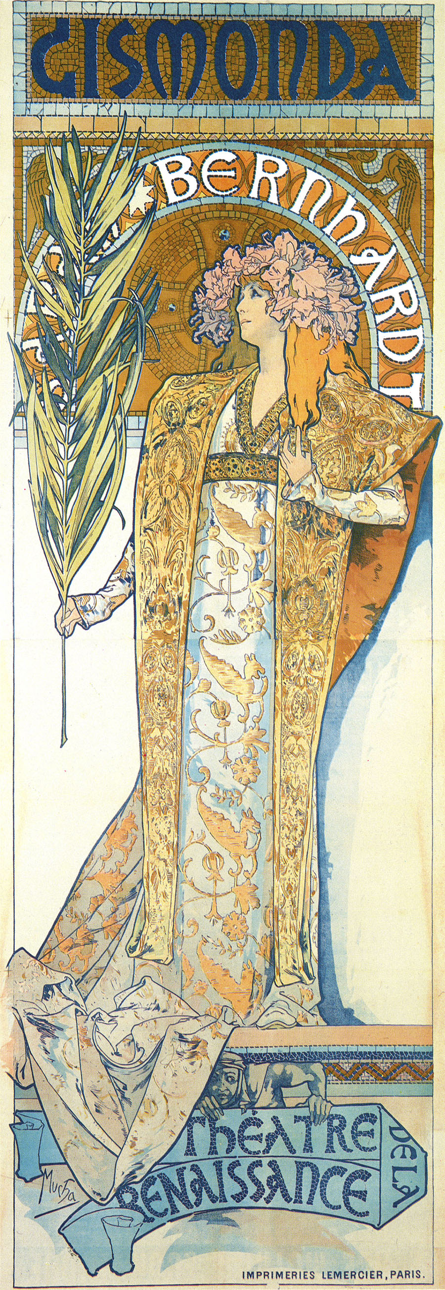
Mucha's work first began to gain popularity when he walked into a print
shop by chance, and there was a sudden demand for a poster for Sarah Bernhardt's new film Gismonda. Mucha told them he could produce a poster within two weeks and presented them with the lithographed image to the left.


Bernhardt was so impressed by his skill and the popularity the posters gained that she entered a contract with him for 6 more years.His elegant, pastel toned posters were in high contrast to other modern artist's at the time, and the style was originally coined 'The Mucha Style' but then named 'Art Nouveau'- French for New Art.

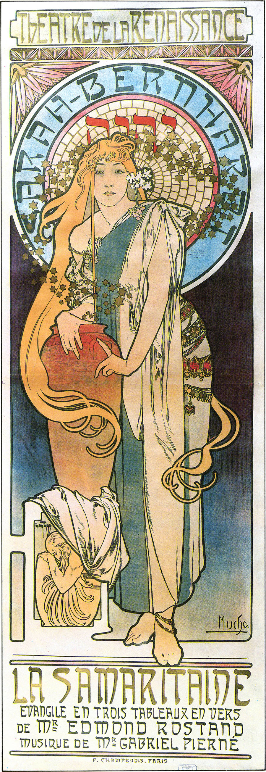
The poster to the left was another of Mucha's Sarah Bernhardt prints. This one was for La Samaritaine, and features much darker tones than much of his commercial work, however the line style and general layout of the image is what cements it to the rest of his work. Much of his advertisement work features graceful, flowing lines and beautiful young women with vaguely Neo-Classical styled robes. They are often accompanied by masses of intricately detailed bouquets of flowers and other typically feminine details.


Mucha in the process of painting the Slav Epic in 1920. image credit to www.wikipedia.org


Mucha also did other works; paintings of personal subjects, especially in regards to the Slav Epic, which Mucha considered his life's fine art masterpiece. The Slav Epic was a series of 20 paintings depicting the history of the Czechs and other Slavic peoples. Mucha worked on the paintings for 18 years, gradually handing over finished pieces to the city of Prague.


After the Battle of Grinwald, from the Slav Epics, by Mucha, image credit to www.wikipedia.com


At first glance these paintings look like a far cry from his commercial works; however after studying the paintings for a while you can discern the similarities between them. For example in the centre of the painting there's a sunlit spot that's been coloured in the soft pastel tones regularly seen in his Art Nouveau posters. The lines are also of the same strong quality, with varying tones and thicknesses where needs be. To be totally honest I think this image shares the same beauty his other works do too; even though the content is almost gruesome I think the still soft colours and technical talent of the artist excell at bringing out an unexpected beauty within.