Wednesday 26 February 2014

Book of Nonsense- First Final Image Development

Then I started working on my first final image, of the Siamese cat, coming in first place.

I wanted the Siamese to look elegant and aloof, with a huge trophy and placecard proclaiming it best in show.

I sketched the cat sitting a few times, altering the way it looked each time:


This was the first real draft of the final image. Although I liked the general pose of the cat, I think it needs the curve and ridge of the neck like in the second two images, and I think the nose is a little too long.

Book of Nonsense- Final Development

Then I needed to develop a layout and composition idea for the poem.
These are my first initial doodles:

The first idea was quite simple, of the cats running around and playing throughout the text.

My next idea was inspired by the book Gobbolino the Witches cat, as there is a chapter where he becomes a show cat and sits on a cushion and wears a nice ribbon and wins prizes for his master.
I thought that the cats could all be in a show, and would be placed 1-5, with the poor Manx cat being unplaced.

Another idea was of the cats sitting in an alley, all looking over a wall at the Manx cat, who would be an undeserving outsider of the group.

I narrowed it down to liking the second and third ideas most and sketched them out in slightly more detail.


I added a bit more explanation to these and elaborated on the layout more.

I chose to use the first idea of the cats being in a show, I felt it had more to it and I would be a lot more inspired to finish this really well. It also gave me more creative freedom as there would be many elements I could customise.


Then I drew some rough drafts of the cats. In 1st place would be the Siamese, proud and elegant, second would be the fluffy Angora cat, third would be the cute Tabby, fourth the tuxedo-clad Black and White, and fifth would be a mottled Tortoiseshell.
Coming last, and unplaced, would be a sad, dull Manx cat. :(


Book of Nonsense- Idea Development

So first of all for the Book of Nonsense I wrote out the poem in my sketchbook, and then defined which breeds/types of cat I would have to research.


I then decided to create a mood board for each breed of cat, and I started with Siamese because it was first in the poem.

 To make the mood board I printed a number of different pictures of the cat and stuck them in my sketchbook. I did this to help me visualise the way I would draw my own Siamese cat.


I also made a nice typographic title page... Just because :)
I also have drawn little sketches of cats (not shown here) to help me know the anatomy of the Siamese better and thus be able to draw it better.

Tuesday 18 February 2014

Cats (Book of Nonsense)

To help further my research for the Book of Nonsense I will be 'profiling' the 6 cat breeds mentioned in the poem and creating a mood board in my sketchbook for each.

What is a breed?

A breed is a stock or collection of animals or plants which all possess a distinctive appearance with features that have been specifically developed further by selective breeding. For example, Arabian horses are known for their 'dished' (concave) noses- thousands of years ago, Arabian nomads would have bred horses with this specific feature together to increase the likelyhood of a foal having this feature too. This method was repeated over time so that eventually ALL Arabian horses have this feature.

Siamese Cats

 Siamese cats are reknowed for their great beauty and elegance. Siamese cats are one of the first recognised Oriental cat breeds, originating from Thailand and China. They are characterised by their elongated bodies and slim frames, along with their large ears, small heads and almond shaped eyes. Their eyes are also a bright baby blue, and they have a lovely point-based colouring (where the darker colours are at the points of the body such as the face, legs and tail).
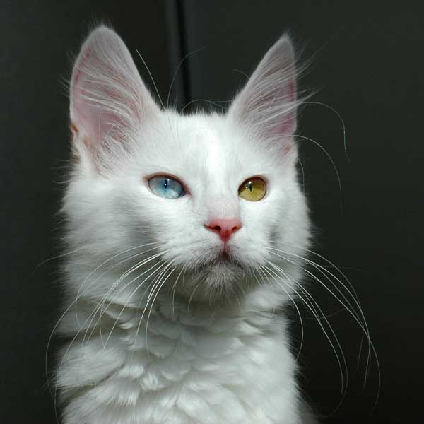

Angora Cats

 Turkish Angora cats are one of the oldest natural breeds of cat, originating from the Ankara region. It is believed to be the origin of the long hair varieties and the dominant white gene. They are usually white but can be any colour, and can have odd-coloured eyes.


Tabby Cats

 'Tabby' is not an actual breed of cat. The tabby colouration can occur in any breed, and as a matter of fact most cats possess the gene but do not always display it due to other active genes.

Mackerel tabbies have stripes running down their bodies, with the stripes gently curving vertically downwards. Mackerel tabbies are the most common type, and have an 'M' marking on their foreheads.


Classic tabbies have a whirled, 'bullseye' like pattern on their bodies and are usually in browns and blacks but can be grey.


Ticked tabbies have agouti hairs, where the hair pigment is broken up into bands of different colours, giving the coat a 'salt and pepper' look.


Spotted tabbies look exactly like the name suggests: the gene is modified so the Mackerel or Classic pattern is broken up into smaller spots and patches.


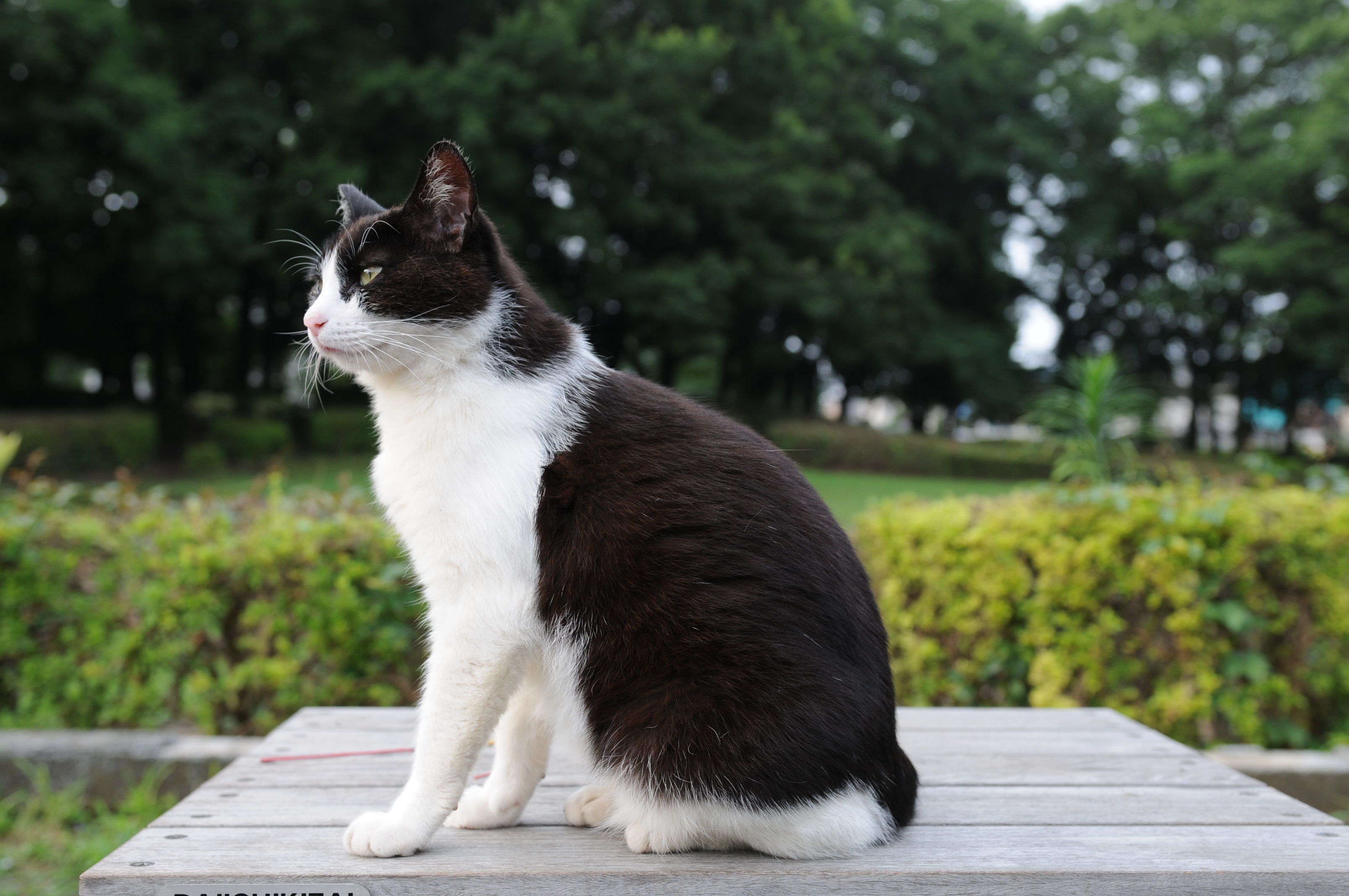
Black and White Cats

 'Black and White' is also not a specific cat breed. The right term is a bicolour cat, and they are white with patches of other colours or patterns. However for the sake of this poem I will be researching black bicolour cats.


Bicolour cats are graded from 1-10, with 1 being completely solid and 10 being fully white. There are also specific patterns which have popular names, such as 'tuxedo' patterns.


Tortoiseshell Cats

 Like the black and white cat, a tortoiseshell is also a type of bicolour cat. However instead of being one colour mixed with white they are usually two or more colours mixed together. Another interesting thing to note is that tortoiseshell cats are usually exclusively female.


Manx Cats

 Manx cats come from the Isle of Man in the UK and are typically tailless due to a genetic mutation which was specifically bred for. Sometimes the cats can have a short, stumpy tail.


Monday 17 February 2014

Gobbolino the Witch's Cat by Ursula Moray Williams

Recently I've been thinking about other illustrated books that I enjoyed reading as a child and immediately thought of this one. Gobbolino the Witch's Cat is the story of a kitten who never wanted to be an evil, mischievous witch's cat- he wanted to be a house or farmcat that could just curl up beside the fire instead of stirring cauldrons and making spells.


I really loved the illustrations in this book because of their scribbly style. The author Ursula illustrated the book herself which I thought was a great idea because an author would know exactly where each illustration should be and where it would be needed most, and would be able to execute it exactly the way they wanted. However not all authors have an artistic talent like Ursula and so there exists jobs for people like me. :D


Just like in Black Beauty there are little vignettes throughout the book which is something I'm beginning to realise is a feature I like in books, as well as chapter illustrations. I love that the drawings in this book in particular are almost just refined sketches- they remind me of my reportage and sketchbook work in that they're not perfect but have a quaint charm about them (maybe because they are so imperfect).


 There are quite a lot of illustrations in this book, more than usual for a story of this length. However although this would be impractical for a lot of artists, because of the style of the work, it meant that it wouldn't be so difficult to put in as many illustrations as want or needed.
While working through The Witches I identified quite a lot of illustrative spikes, many being small vignettes, and so maybe I could try doing my own drawings in a quicker, colourless style to be able to achieve this.

Sunday 16 February 2014

Black Beauty by Anna Sewell

Black Beauty was one of my favourite novels as a child and in the hardback edition I own I've always admired the watercolour illustrations inside. This book was illustrated by Kate Aldous in watercolour and pencil, in an accurate style with plenty of colour and life.


 This was one of the first full page illustrations in the book. As you can see, the use of colour is bright and vivid, and the dynamic composition of the drawing gives it plenty of movement and flow. I love the 'realistic' style of the drawing too, which is something a lot of modern illustrators forego in favour of their own wackier styles.


Another thing I really like about this book is the vignettes in each chapter. There are lots of these throughout the book, both big and small, with some taking up 2/3 of the page like the one above. The text has expertly been moulded around the images and helps to punctuate key points of the text which don't require full-page illustrations but definitely benefit from the extra visuals. 

 
These are two of my favourite full-page illustrations in the book. The watercolour paints are the perfect choice of medium for this kind of realistic illustration because although bright and colourful they can also produce just the right tones and colours for human and animal forms. They are a great choice to use for children's books and illustrations because of their friendly, inviting atmosphere.


The small illustrations for each chapter title are also features I think work really well in this book and style of illustration. They definitely help to keep the book interesting and engaging for children- the book itsself is particularly long and while I could read it all the way through without losing interesting, I know not every child could and the illustrations definitely spurred me on to read even more voraciously.

Wednesday 12 February 2014

First page of Development- Boy

So far through this module I've found it difficult to come up with good ideas and concepts for characters in my head.
It sounds stupid but I've felt almost afraid to draw anything- after being disappointed with some of my work in the previous module I think I didn't really want to start drawing in case what came out wasn't up to the standard I wanted, and besides, staring at a blank sketchbook page can be quite daunting at times. 

Today I finally took the plunge and just started drawing. I had a vague idea of what I wanted the Boy to look like, and so I started to record that on the page. What I've realised is that when you have an image in your head of a character or image, some of the details are lost in translation when you put it onto the page, which is why development is so important because when you continue to draw the characters you can refine them to the point that the image you have in your head properly matches what is in front of you.


So on this page I just tried a lot of different styles of glasses mainly. I wrote little notes detailing my thoughts about the drawings in case I forgot. I also doodled some possible proportions and figures for the boy, as he could be any shape, just not fat.

Character Profiles

To help get me started with my character development I started reading through the book again and writing notes about each character which would be illustrated. Like Blake has done in the original illustrations, I have decided also that I would like to draw the 'cast' of the book to present at the beginning.

However instead of doing all 6 characters I have decided I will only be presenting the Boy, his Grandmother, Bruno and the Grand High Witch. My reason for this is that I feel like Mr. Stringer and Bruno's parents aren't very prominent characters in the book and although I will be developing what they look like I won't be promoting them like the other four.

So to start off with this I began writing down some notes about each character to give me some ideas on possible designs for each character.


Some of the characters features were mentioned in the book, like that the Grandma is over 80 and has a larger, cuddly figure, but the boy was quite undescribed throughout and so it was up to my imagination to produce a character for him.

These were my initial thoughts on each character, and will provide the basis for my first character sketches. I also need to think about the fact that the two boys will have two character models as partway through the book they are transformed into small mice. 


And now enjoy this old engraving of some common mice:


Tuesday 11 February 2014

Notes on Character Development

Last week we had a discussion about character devlopment, with our tutor Ben leading the talk.

I took some notes about what he was saying to aid me while developing my characters.

  • I should be able to draw my characters in any position, clothing and angle. I need to know them inside out. 
  • Life drawing and reportage are valuable sources of reference 
  • Keep all character doodles and sketches, along with sketchbooks of development
  • Squared sketchbooks can help keep proportions proper
  • Experiment with facial expressions and try using own face for reference
  • Once characters are established, then experiment with colour and medium
  These are some useful pointers, some of which I do already, such as using square sketchbooks, but I should try more of these things throughout the project such as looking through my life drawing and reportage more often.

Life Drawing 10/2/14

For the first time in a while we finally had a female model to draw. Again I made a concious effort to break away from my usual pencil/fineliner sketches and used a lot more varying techniques.


First sketches with pencils. 3 minutes each. 


In this sketch we had 3 minutes to draw the model using straight lines. My approach to this was to use a magenta felt tip to draw lots of small straight lines. However I wasn't very pleased with the result, it was harder to get down a good draught of the model and so some of the proportions were off. If I tried this again I would probably try it with a medium that could be built up in layers such as charcoal or pencil. 


This was an experiment I liked slightly more. Instead of drawing with only straight lines, in this I used flowing, bubbly circle lines. Again I tried a felt tip, this time choosing a blue one because bubbles remind me of the ocean, and I thought that the way I could build up the density of the circles was a great way to discern areas of light and shadow. 


And then this was my favourite of the three line experiments. Again using felt tip, choosing a navy blue, this was a continuous line drawing that I actually really liked. Usually I'm not the biggest fan of line drawings as I'm more accustomed to using small sketchy strokes but while I was drawing it I thought it almost looked like a puppet doll with the separations at each joint like the elbows, knees and shoulders. After that I tried to keep the rest of the drawing in the same vein and I feel really happy with the outcome. 


This was a drawing with a dark charcoal pencil. After drawing out the figure, I added some tone using the charcoal pencil and smudged it with my fingertip to add a softer touch. Although unfinished I think the tone adds a lot of depth to the image and I like the expression the model is holding. 


This was a drawing with coloured pencil. I find coloured pencils a lot different to regular pencils to draw with in that they tend to wear down a lot quicker and it can be hard to get a fine, sharp point. However this was a coloured pencil drawing I liked (apart from the feet and head) because I took my time with this and carefully added lines and small areas of tone. I tried to draw the feet more closely because they were at an odd angle but I don't feel I was successful with this because I couldn't quite get the foreshortening on the feet down properly.


Throughout the longer poses I moved around to be able to capture the same pose at different angles. Again using felt tip, I thought this was a decent attempt at the angle because the foreshortening of the body can be quite difficult to get right. 


Then I tried using some A3 size paper instead of my usual square sketchbook. For this drawing I used graphite sticks, a 2B and a 9B. I used the 9B to sketch out the general figure and too add tone, while the 2B was used to draw details and strengthen lines. 


Again I used graphite for this drawing, however I only used the 2B for the face because the 9B was too soft to record the details properly. This was my favourite drawing of the session because I think I've got the anatomy of the model down accurately and I really enjoyed working larger with the graphite. 


Then when I had some time left over I tried drawing with fineliner. It took me a little longer to get to this stage than with the graphite as I had to think more about where I would put my lines and how strong they should be at each part. Even though I didn't finish it I'm happy with the progress I made in regards to drawing with fineliner and I will definitely try it again.

Bowes Museum Reportage

When we went to Bowes Museum, along with my DSLR I took my small square sketchbook to get some reportage.


There were three sketches that I really really liked. This one was a pencil drawing of the Silver Swan automaton, which is made of silver, worth over £500,000 and is almost 250 years old!


Because there were a lot of Baroque and Roccoco features within the museum this meant there were lots of interesting arches and sculptures to draw. I really like this one because I think that theres a good sense of depth in the image and I'm happy with the light suggestion of expression on the bust at the top of the arch. 


Although I didn't particularly like the drawing of the architechture in this sketch, I did like the sculpture drawing underneath. I wish I'd had more time at the museum so that I could have drawn the full sculpture in detail but I'm happy with this quick drawing of it.


Monday 10 February 2014

Life Drawing 3/2/14

Last Monday we had our first life drawing session of the module, drawing a male model we have previously drawn in another session.


This was one of the first sketches I did in this session. In the previous module I used a lot of the same materials and techniques so this module I'm trying to branch out a little more, hence the orange pencil. This sketch definitely isn't the best of the session, it was more of a warm up drawing to loosen up. 


In this sketch I used a 0.3point fineliner and a green and blue pencil to add areas of tone. I always dislike drawing poses like this because I always feel like they never turn out well. I find it hard to draw the angles and curves. 


This was another experiment with adding tone using coloured pencils. I quite liked this and would have liked to finish it, although he looks like a green human-slug thing in this pose which I find moderately amusing. :D


 I liked the odd angle of this sketch. I thought I tackled it well and recorded the anatomy of the model properly considering the awkward shapes the face makes in this position. Used a 3B pencil.


I also drew a close-up of the models foot. Feet are interesting to draw because they can be so different (and disgusting!). Here I used a 0.2point fineliner and a 3B pencil to add some tone to the foot as the way the tendons in the foot cast interesting shadows was something that I really wanted to practice recording. I really liked this sketch, it was definitely one of my favourite, if not because of the subject but because of the technical aspects.


Here I used a pencil for the main drawing and then a graphite stick to draw the close-up. Recently I've been finding myself having time to spare after each sketch so I've been taking it upon myself to draw little extra bits to keep it interesting. I think it's interesting how there isn't much difference between the two mediums in the photograph but in the actual sketchbook you can see the differences in texture. 


Throughout our lifedrawing sessions I've done quite a few drawings with my left hand. Although it can be quite difficult to control the medium with my left hand, I've found that the chunky graphite sticks produce a really good drawing like the one I did in this session. I think because the graphite is thicker than a pencil or pen it's easier to work with and I think that a lot of my left handed drawings have tons of character and life to them. This one almost looks Neanderthal with the hunched back and vapid expression (no offense to the model!).


This was a sketch from memory. For the 2 mins allotted I did not look at the model at all- before drawing we were allowed 2 minutes to look at the model and take in their features. I thought I did really well with this, the only problem I had was with the angle of the arm and the charcoal pencil I used was a great way to add hints of tone and muscle. 


This was my favourite exercise of the session, as we were to draw a portrit. Well for me, I love drawing people, which is why I enjoyed it so much. However I did want it to be a little different so I again used a green pencil.