Showing posts with label digital manipulation. Show all posts

Tuesday, 4 February 2014

Tom Lind

Tom Lind is an artist featured on Behance. What caught my eye was the thumbnails of his moleskin sketchbook drawings, because they looked very interesting in terms of the mark making and technical elements of the sketches.


In the sketchbook it looks as though he's used a combination of ink and marker pens, doodling across the pages. The drawings have been given a flowing composition across the spreads which is something I really like about these sketches.


He also leaves a lot of white space around the images, but I think this is a good thing in that it emphasises the clean, neat edges of the drawings. A lot of the lines are marked in short, quick strokes, sharp and angular, as seen in the above detail shot of the second spread. Most of his tonal elements come from the cross hatching method, which is something I haven't really experimented with but could definitely try to develop in the future.


These two spreads were from his Bauhaus sketchbook. The sketchbook itsself is almost like any other except the bottom edge is cropped at an angle, giving it an odd overall shape. Again the sketches in these spreads flow across the page, leaving a lot of white space around, again adding to the odd composition. In the first one I really like that he's added a splash of cyan blue because it really draws the eye to that specific focal point and then allowing the eyes to wander over the rest of the image.

The second spread I like because it's very different from the first three spreads presented. Although there are of course similarities, like the page composition and flow of the piece, in this one there are no solid blocks of black ink to contrast with the rest of the work. However because there's so many different images within to look at, I think it works equally well and shows off his technical ability to another level.


The white space left around his work reminds me of my own submission for the Digital Manipulation unit in Module 1. The white space directs your eye right to the main focal point of the image and emphasises the strength of the line and the bright colour used. I also think there's a similarity in the atmosphere of the images- my horse possesses a lot of momentum and impulsion whereas Lind's spreads flow easily along the page, like a cloud across a summer sky.


all images for research purposes only

Friday, 3 January 2014

Digital Manipulation- final pieces 3 & 4

The second half of my submission for Digital Manipulation were two mixed media pieces. They both started off as digital sketches, and then I printed them and painted over them to eventually edit them in Photoshop.

This was my favourite piece out of all of my final images. I used a mix of watercolour and brusho paints to apply the colour and then edited and cleaned up the image in photoshop. This is my favourite because of the momentum and flow in the image- I feel like it has a big presence and a lot of energy which is something I admire in other equine artist's work. 


As my fourth and final image, I thought this was a good attempt at changing colour and playing with contrasts in Photoshop.

Digital Manipulation- final pieces 1 and 2

For our Digital Manipulation unit we were to produce 4 final images.

 
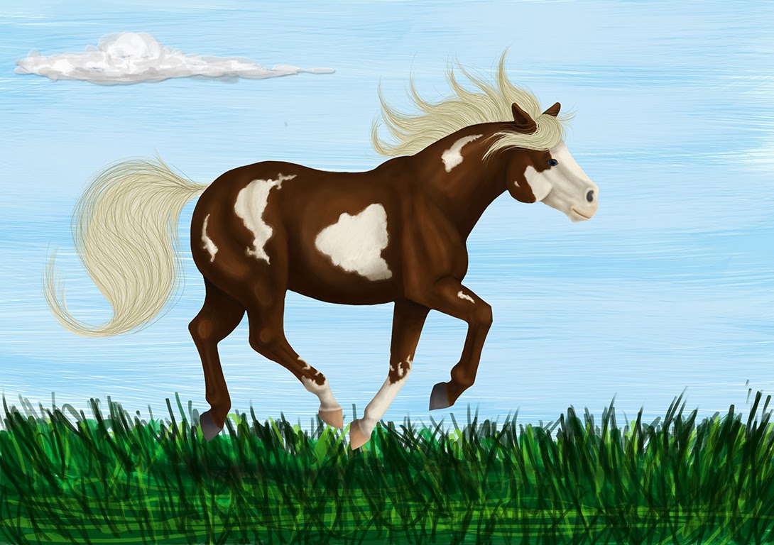
 This was my first final image for digital manipulation. I spent quite a lot of time on this image, digitally painting it by starting with one base colour and then building up the shading and highlights from there. To get the white patterning I used a clipping mask over the colour layer and added the white where I wanted too. I locked the layer when I was satisfied with the shape of the patterns and then shaded them according to the rest of the body.


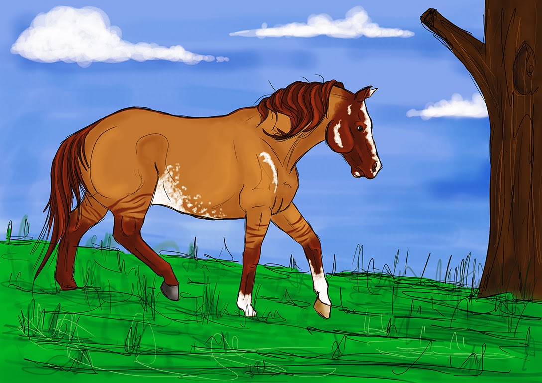
My second image had a similar approach to the first, although I specifically spent a lot less time on this one. I began in the same way by drawing some lineart and then colouring in the base. However this time I only added light shading and highlights, and I tried a different technique of colouring the hair all together. Instead of building up the hair with lots of layers of separate strands, I instead coloured different 'chunks' of the hair in different shades. I prefferred this image to the first one, mainly because I think the colours are a lot more complimentary to each other and I liked that I didn't have to slave over it for hours on end to produce a good end result.

Tuesday, 19 November 2013

missmessymess

Another deviantartist, missmessymess has an eclectic collection of works, ranging from digital illustrations to reportage done in pencil and other works in acrylic on boards.

image credit to missmessymess.deviantart.com

image credit to missmessymess.deviantart.com - the pencil sketch for the below piece
image credit to missmessymess.deviantart.com
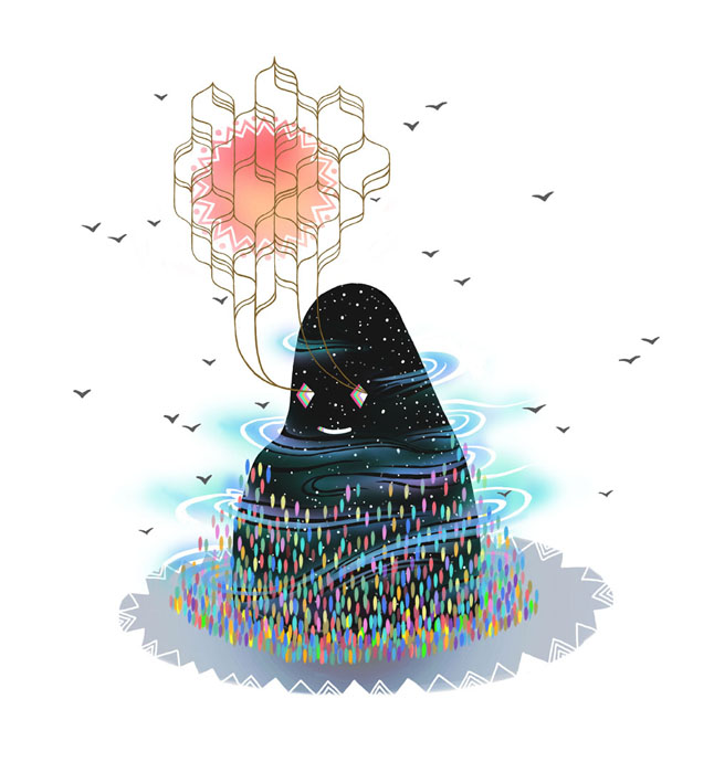
These are a range of her digital works. Their use of colour and texture is interesting, and the subjects painted are really strange and quirky and fit her illustrative style perfectly.
I like the simplistic style of the works- it realls works with the colours and textures and ensures that there isn't an overload of visual information in the picture.

image credit to missmessymess.deviantart.com

Above are a series of reportage illustrations done by her, all based around a pub called '6 million postcards'. I love her way of shading and the toned paper she uses. They give the drawings much more character especially considering that they are pub based and the tones used fit this image. I myself would love to have a toned sketchbook to draw in and would defintely consider making my own- this is partly why I've been colouring my own sketchbook papers with paints and inks.

image credit to missmessymess.deviantart.com

These are her other traditional works. Most of them are done in acrylic paints on boards. You can see her illustrative style coming through in the way the same kinds of colours are used, although the textures are different to those in her digital works.


RESEARCH ONLY- ALL IMAGES CREDIT TO MISSMESSYMESS.DEVIANTART.COM

joybeans

joybeans from deviantart has produced some pretty intricate line drawing reportage.

image credit to joybeans.deviantart.com
I like the splashes of colour in the latter two works, as I think it helps define the focal point properly as well as add some variety into her work.
I think because those two sketches are not as delicately detailed as the former two, the colour helps differentiate the two 'styles' almost.

Although I like her work, and think it has a very cute style, I something like this would not work well for me as I like to draw with long, flowing lines with lots of movement and room to manouver, instead of drawing neatly with lots of straight, short lines.

image credit to joybeans.deviantart.com

image credit to joybeans.deviantart.com

They have also done some digital paintings and sketches.

image credit to joybeans.deviantart.com


RESEARCH ONLY- IMAGE CREDITS TO JOYBEANS.DEVIANTART.COM

Feverpaint

Feverpaint is an artist who works in digital mediums, using a Wacom Intuos tablet and Photoshop CS5.

image credit to feverpaint.deviantart.com - an example of a good greyscale base coloured multiple times.
credit to feverpaint.deviantart.com

Feverpaint works in a number of different styles- they are proficient in creating near-photorealistic digital paintings also and their use of light and tone is excellent. They also do some great pieces that use cell shading.

credit to feverpaint.deviantart.com - an example of cell shading

credit to feverpaint.deviantart.com

Another thing I like about their work is the movement and momentum within it. As their subjects are usually horses being ridden in certain disciplines like dressage and show jumping, they are often drawn in high-impulsion poses with loads of life in them.

credit to feverpaint.deviantart.com

However they also paint portrait style pieces that are hyper realistic too.

credit to feverpaint.deviantart.com

credit to feverpaint.deviantart.com

One day I would like to develop my digital painting skills to this level. There are other similarities in our work like the fact that we both draw our horses in usually quite dynamic poses with lots of energy and movement. However I also like that her more static images contain a lot of character and this is something I would like to develop in my own work.


RESEARCH ONLY- ALL ART CREDIT TO FEVERPAINT.DEVIANTART.COM

Monday, 18 November 2013

Colouring greyscale bases in photoshop


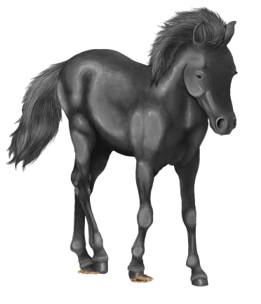
a finished greyscale base
 This is a finished greyscale base I created. I spent quite a while on this, making sure the contrasts were good and that it was detailed properly.

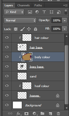
To start colouring it I first make a new layer with a clipping mask for each part of the base- so for the body, hooves and hair. All you need to do to make a clipping mask is check the box for it when the New Layer window pops up.


my layer palette with all the clipping masks added
 As you can see in the layer preview window, I've scribbled all over the body colour layer. Because I have a clipping mask added to the previous layer it means that everything on the colour layer will be confined to the space of the base layer.

the result of the clipping mask

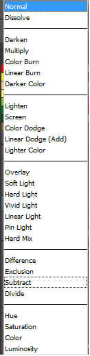
Then to actually use the base properly I change the Layer Style of the coloured layer to 'Soft Light'. There are many other styles to be chosen from however I think 'SL' gives the best balance between tone and colour.

all the layer styles in photoshop
'Soft Light' layer style VS 'Overlay'.
Above is a comparison of two layer styles, 'Soft Light' (which I use) and 'Overlay'. Personally I think the overlay setting makes the colour too saturated- especially when working with brighter colours, and if it looks a little underexposed like the one on the left you can always use the Curves tool to edit the contrast and lightness of the base.

a bay and black tobiano coloured horse
a liver chestnut leopard horse and a RAINBOW PONY :D
With more complex greyscale bases you can build up layers and layers of different colours, however I can work with one layer just fine.