 |
| image credit to www.codex99.com |
Alphonse Mucha is by far one of my favourite artist- I love all his work from his commercial posters and advertisements to his personal work.
Mucha's work first began to gain popularity when he walked into a print
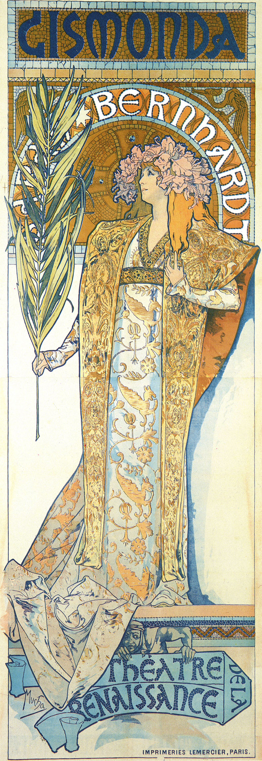
shop by chance, and there was a sudden demand for a poster for Sarah Bernhardt's new film Gismonda. Mucha told them he could produce a poster within two weeks and presented them with the lithographed image to the left.
Bernhardt was so impressed by his skill and the popularity the posters gained that she entered a contract with him for 6 more years.His elegant, pastel toned posters were in high contrast to other modern artist's at the time, and the style was originally coined 'The Mucha Style' but then named 'Art Nouveau'- French for New Art.
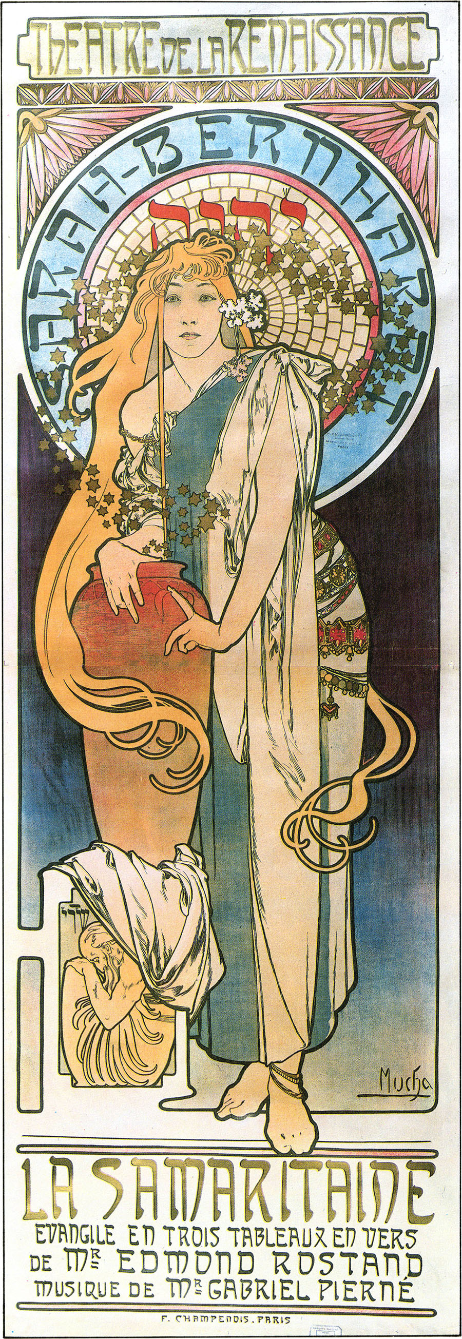
The poster to the left was another of Mucha's Sarah Bernhardt prints. This one was for La Samaritaine, and features much darker tones than much of his commercial work, however the line style and general layout of the image is what cements it to the rest of his work. Much of his advertisement work features graceful, flowing lines and beautiful young women with vaguely Neo-Classical styled robes. They are often accompanied by masses of intricately detailed bouquets of flowers and other typically feminine details.
 |
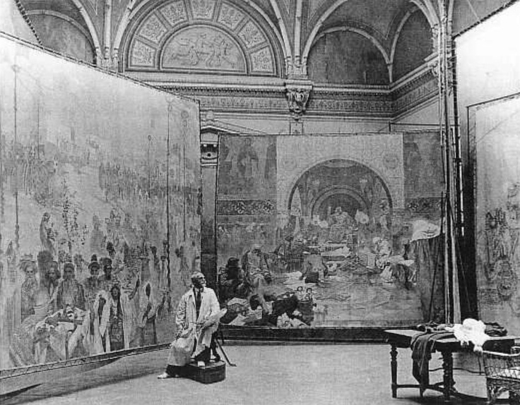
| Mucha in the process of painting the Slav Epic in 1920. image credit to www.wikipedia.org |
Mucha also did other works; paintings of personal subjects, especially in regards to the Slav Epic, which Mucha considered his life's fine art masterpiece. The Slav Epic was a series of 20 paintings depicting the history of the Czechs and other Slavic peoples. Mucha worked on the paintings for 18 years, gradually handing over finished pieces to the city of Prague.
 |
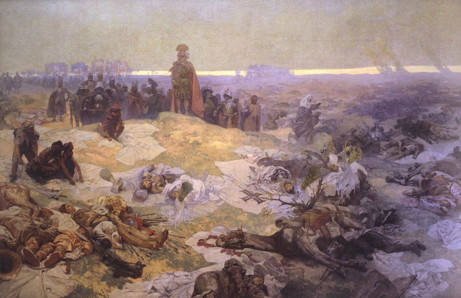
| After the Battle of Grinwald, from the Slav Epics, by Mucha, image credit to www.wikipedia.com |
At first glance these paintings look like a far cry from his commercial works; however after studying the paintings for a while you can discern the similarities between them. For example in the centre of the painting there's a sunlit spot that's been coloured in the soft pastel tones regularly seen in his Art Nouveau posters. The lines are also of the same strong quality, with varying tones and thicknesses where needs be. To be totally honest I think this image shares the same beauty his other works do too; even though the content is almost gruesome I think the still soft colours and technical talent of the artist excell at bringing out an unexpected beauty within.


No comments:
Post a Comment