
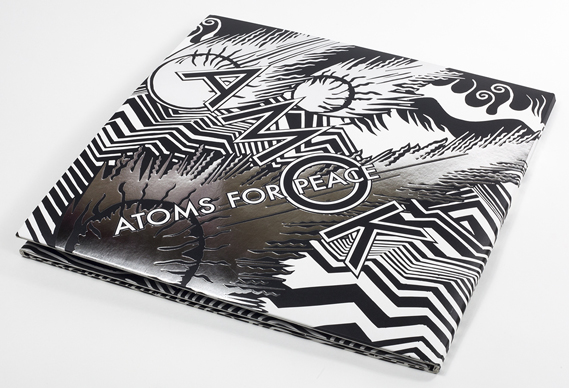
Now, this type of illustration isn't my style, but I can appreciate the technical ability that comes into this. I can also appreciate the spectacular Limited Editions of this album (in both CD and vinyl), with its (again) concertina folds showcasing a full spread of Donwood's intricate work.


The illustrated spread shows a post-apocalyptic scene of the Hollywood hills. Quite fitting then, for an album named 'Amok' by a band called 'Atoms for Peace'. This shows that a certain synergy between album and artwork is needed to draw the audience in, especially those that would be interested in purchasing a collectors item such as this.
Although my album packaging probably won't span the same length as this I think I definitely want it to have a decent amount of image space. In this design the title text is merged with the illustrations but this isn't really my style of doing things and so I would need either a clear space or a separate canvas entirely to house the text.
No comments:
Post a Comment